Tic Tac is a brand of mint candies, owned by Ferrero Group. The label was established in 1968 and today is distributed in more than 100 countries worldwide. Tic Tac produces candies in various flavors and is known for its small pocket-size packaging.
Meaning and history
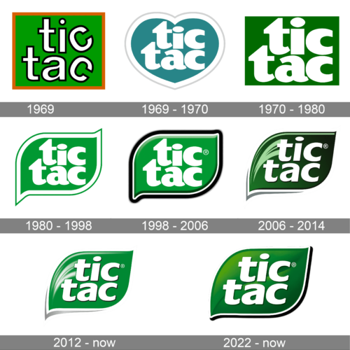
Ferrero started selling the so-called Refreshing Mints in 1968. The current name was adopted two years later. It was inspired by the characteristic sound of the mints rattling in their box.
1969
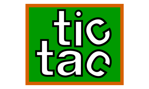
The ‘69 design is just a green square with some orange framing. The name was divided into two bits, one per line of text. The letters there were lowercase serif characters colored white with black outlines. They were also aligned on the right, and the ‘C’s on the end of each word was rotated in its own direction.
1969 – 1970
The earliest Tic Tac logo already features the elements by which it has been recognized ever since. You can see the familiar leaf-inspired shape containing the white letters, which, in their turn, are inspired by the color of the product. The dot above the “i” has an elliptical shape reminding the shape of the mints. The rounded, plump glyphs (especially the “a” and the “c’s”) seem to have been inspired by the mints, too.
The bright green color supports the botanical theme started by the leaf shape. The white and green trim adds a final touch.
1970 – 1980
This emblem uses the same wordmark, except they got rid of the blue heart and took a simple green square as the background.
1980 – 1998
The redesign of the 1980s introduced a new shape for the TicTac logo — a stylized leaf, which was composed of a rectangle, slightly extended horizontally, with its upper right and bottom left corners sharpened and elongated, and the upper left and bottom right ones smoothened and rounded. The green badge was outlined in white and green. As for the inscription, it was executed in the lowercase of an extra-bold fancy typeface in white.
1998 – 2006
In 1998 the iconic TicTac logo gets three-dimensional due to the use of gradient shades and the refreshed glossy surface of the green “leaf”. The letters also got refined, with their contours cleaned and some light shadow added around them. As for the white bodies of the symbols, they also got some gradients to look more voluminous and fresh, just like the mint candies of the famous brand.
2006 – 2014
The metaphorical core has remained unchanged, although the design has been redrawn.
Once again, we see the leaf shape, which has now grown a little more refined and elongated (this made it looked somewhat closer to an actual mint leaf). The white, light green, and grey highlights and trim add some depth and make the design more realistic producing, therefore, a more “fresh” and “natural” feel.
2012 – now

The redesign of 2012 has added volume and gloss to the Tic Tac badge, with the shade of the background getting lighter, and the outline of the white characters more distinctive. The concept remained absolutely the same, but with the new shade of green, the white strokes on the left started working as light reflections, making a fresh and lively image.
2022 – now
In 2022 the Tic Tac logo was redesigned again, with the shape of the badge and the typeface of the lettering being kept, but the colors and the pattern changed. The white strokes were removed from the composition, and instead, the badge was colored in a gradient shade of green, imitating a leaf texture. As for the inscription, as already mentioned, it has kept its font but got the characters slightly enlarged and their contours cleaned up.
Font
The type on the second version has grown lighter, with more angles. While it reduces the similarity with the product, it supports the low-calorie count idea. In other words, it promises to keep you slim, while the previous logo implied “plump.” The designers have kept the ellipse above the “i,” though.
Colors
As for the shade of green, it is not easy to decide which one is closer to the actual leaf. The original logo is closer to the color of the leaves when they are under the bright light, while the second one is for the leaves without the light.
Nevertheless, we can say that the darker shade, which is used in the current Tic Tac logo, does not have the plastic feel of its predecessor. It looks more natural.


