Those who are used to the way the Kit Kat bar looks in the United States might be surprised by its package and, possibly, even taste in other countries. The packages are different, as are the manufacturers: in the US, the confection is made H.B. Reese Candy, which is part of Hershey, while Kit Kat sold in other countries is made by Nestlé.
Meaning and history
Kit Kat has shown itself as a brand which is very constant and confident in everything connected with not only the quality of the product but also its style and package design. The company had not too many redesigns of its logo throughout the years, and they were all a graphical representation of the evolution and development, not more.
1935 – 1937
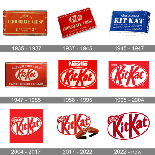
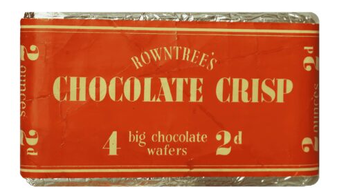
The brand was established as Rowntree’s Chocolate Crisp in 1935 and had its first logo designed in the same year. It was a simple composition, where the white lettering was placed on a solid red background. The “Chocolate Crisp” part was written in all capitals of a bold and elegant serif typeface, while the “Rowntree’s”, arched above it, used a more lightweight and delicate font.
1937 – 1945
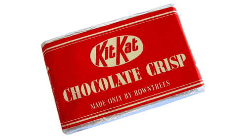
The product was rebranded in 1937, adding the “Kit Kat” part to its name. And the predecessor of the logo we all can see today was introduced right after the name change. The solid red background and the “Chocolate Crisp” parts remained untouched, while the arched “Rowntree’s” inscription was replaced by a horizontally stretched white oval with red “Kit Kat” lettering on it. The new logotype was executed in a bold custom sans-serif with the lines of both “K”s elongated.
1945 – 1947
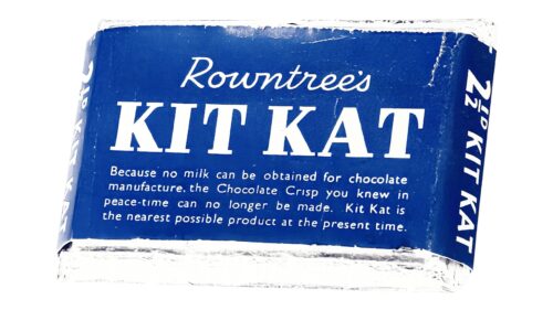
For only two years, starting in 1945, the company was producing a dark chocolate version of its product and called it “Blue Label”, replacing the Ted background with the bright blue one. The “Kit Kat” logotype was placed right on the blue packaging, written in elegant serif capitals. It was made because of the problems with milk chocolate, which occurred during World War II.
1947 – 1988
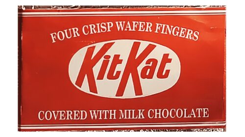
The redesign of 1947 brought back the original red and white color palette, enlarging the white oval with the “Kit Kat” inscription and placing it in the middle of the composition. The additional lettering was placed under and above the main element, written in capitals, and executed in a traditional serif font.
1988 – 1995
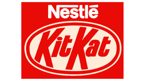
The brand was acquired by Nestle in 1988, and all the additional lettering was removed from the logo in the same year. Now the white “Nestle” logotype in its custom typeface was placed above the oval, which gained a double red and white outline.
1995 – 2004
The contours and lines of the logo were refined in 1996, making the major inscription bolder and more elegant. The red of the Kit Kat logo became more intense and bright, which made the whole emblem look confident and professional. The “Nestle” logotype was now written in small letters and placed on the left of the emblem, underlined with a smooth curve.
2004 – 2017
In 2004 the oval was placed a bit diagonally and some gradient shades were added to the logo. The “Nestle” part was now set on an ornate heart-like element, executed in red and outlined in white. All the symbols of the emblem now looked more voluminous and sleek, due to the light red gradients.
2017 – 2022
The lines of the logo were strengthened and refined again in 2017. The composition remained untouched, just the red color became more intense and dark and an image of crispy chocolate was added to the bottom part of the logo.
2022 – now
The logo radiates a sense of legacy and trust with its classic design. Dominated by a rich crimson hue, it showcases the iconic “KitKat” lettering, boldly emblazoned in white. The typography is distinctive, with angular cuts on the letters K and A, conveying dynamism and taste. Enveloping this central text is an elliptical boundary, reinforcing the brand’s universality. Perched above is the “Nestlé” insignia, a testament to the renowned brand’s backing. The deep red shade evokes feelings of passion, indulgence, and the delectable flavor that awaits inside every KitKat bar. This emblem seamlessly combines heritage with a promise of premium quality.
Old packages (Rowntree’s)
Because of the ingredients shortage resulting from the World War II, Rowntree modified the recipe. A brand-new package was introduced, blue with bold letters. The words “Chocolate Crisp,” as well as the oval, were gone.
As soon as in 1949, though, the elliptical logo was back, in a slightly modified design.
Symbol
When the brand was purchased by Nestlé in 1988, the logo was modified once again. The letters grew bolder, the parent company name appeared above the ellipse, which acquired an additional frame. A brighter shade of red was introduced.
As a result of the 1995 redesign, the logo adopted a more playful look, with the lettering slanted upwards.
Emblem
Hershey got a license to make and sell Kit Kat in the US in 1969. Ever since, both the package and advertising within the country was different from those used abroad. For decades, the brand name was given in white letters with a black frame, against a simple red background. Since 2002, the packages of the Kit Kats sold by Hershey also feature the ellipse shape, like Nestlé Kit Kats, yet the color scheme is slightly different, as well as the glyphs.
Font
One of the features differentiating Nestlé Kit Kat logo from the Hershey’s counterpart is the typeface. Nestlé uses a more playful and friendly type with two different “K’s” and a 3D effect, while on the Hershey’s product package, the letters are flat, bold, and rather straightforward.


