

![]() Panera Bread Logo PNG
Panera Bread Logo PNG
The logotype of the Panera Bread Company, one of the most successful chains of bakery-cafe restaurants in the US, is built around a metaphor that is closely connected to the specific process of making break used by the company.
Meaning and history
![]()
The visual identity of a famous bread brand has been pretty consistent throughout the years, having one main symbol, a lady with a baguette as the theme, making the image recognizable and memorable.
1987 – 2011
![]()
The very first logo for Panera was introduced in 1987 and composed of an emblem and a wordmark, placed under it, with a tagline in an oval frame, resembling a baguette.
The image of a woman with a bread loaf was smooth and stylized, executed in several curved lines, with her hair weaving to the right. The emblem was executed in black, so was the wordmark, which was written in a bold custom typeface with sleek soft contours, in a lowercase. Under the name of the brand, inside the oval baguette frame, there was a “Bread” lettering in a handwritten font, resembling of Asian hieroglyphs.
2005 – 2011
![]()
It’s the same logo as the one before it, except ‘bread’ and the oval around it are smaller.
2011 – 2020
![]()
The logo from 2011 repeated the previous version, but some elements were changed. The color palette was switched from monochrome to brown and beige, which game a warmer look to the emblem. The lady with the bread was placed in a smooth abstract beige figure, which repeated the shape of the image.
The main wordmark was refined and modernized, while the “Bread” tagline was now written in all-caps of a simple sans-serif typeface, without any framing. This logo is still in use today, its first version was introduced in 2005, but after several modifications, it was finally accepted as an official one.
2019 – Today
![]()
The additional logo, created for the brand in 2019, features a different composition. It is mainly used for banners on the branded stores and is set in one line: with “Panera” in its custom smooth typeface, an emblem on its right, and a “Bread” inscription after it, the emblem of this secondary version also features an image of a woman, but here she is holding not the bread loaf, but three wheat ears.
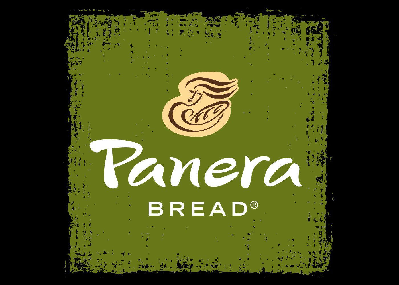
2020 – Today
![]()
This one consists of the text parts just like in the 2011 design. Here, however, the letters in ‘bread’ are thinner, and the entire logo is also dark green.
Symbol
The central metaphor behind the Panera logo is that of so-called Mother Bread. To understand it, one has to know that while making sourdough bread the Panera bakers use a small amount of the dough used to cook the previous batch of bread dough. Bakers call this piece of dough the “mother”. When a new Panera restaurant is opened, the “mother” of the first Panera bread cooked in the 1980s is taken there no matter how far the new bakery is located.
Emblem
The Mother Bread as depicted on the logo is a smiling woman looking at the loaf of bread she is holding in her arms as if it was a baby.
Font
![]()
The Panera logo features a unique bespoke script. It looks as if the name of the company was carelessly written by hand. The smooth, curvy lines go perfectly well with the picture of Mother Bread.
Color
![]()
The color palette seems perfect for a bakery. The letters and the outline of Mother Bread are given in dark brown, while the background is beige. Both the colors are somewhat evocative of the colors of pastries.


