

![]() Oreo Logo PNG
Oreo Logo PNG
Oreo is a famous brand of chocolate sandwich-cookies, manufactured by Nabisco. Oreo, launched in 1912, is one of the world’s most popular cookie labels and the best-selling one in the USA.
Meaning and history
![]()
Oreo is definitely one of the iconic brands with the most number of logo redesign in history. There have been more than ten different versions of the emblem for the famous cookies created, and most of them were completely different from each other.
What is Oreo?
Oreo is the name of an American brand of cookies, which was first introduced in 1912, and hasn’t lost its popularity by today. Two chocolate cookies with a white cream between them are known and loved by people of all ages from all over the globe.
1912 – 1923
![]()
The very first logo for Oreo was introduced in 1912 and stayed with the brand for almost a decade. It was an elegant and ornate black inscription in all capitals with the first “O” enlarged. The letters featured a distinct white outline and were placed on a calm and dark sea-blue background. The combination of the colors on the original brand’s logo looked sleek and luxurious.
1923 – 1931
![]()
The redesign of 1923 brought a completely new concept to the visual identity. The background was now colored red, and a lot of additional lettering was added to the nameplate, which first and last letters were replaced by two circular cookies, outlined in white and blue, like the other letters of the main wordmark.
The additional text was written in four levels using four different styles, blue, white, and black.
1931 – 1936
![]()
The logo, created in 1931 was pretty similar to the original version but used a different color palette. It was an elegant white inscription with a black outline, placed on a horizontal rectangular with the red background and black vignettes around its perimeter.
1936 – 1940
![]()
The new color palette was introduced in 1936. The blurred blue wordmark was placed diagonally, in the upright direction, on a bright yellow background. This combination of colors made the brand’s products stand out on the shelves of the stores.
1940 – 1949
![]()
The blurred contours remained the main decorative element of the Oreo logo after its redesign in 1940. The rebranded visual identity was composed of a red logotype placed on a white background. The lettering was executed in an ExtraBold typeface with thin elongated serifs.
1949 – 1952
![]()
The logo of 1949 featured a burgundy rhombus placed on a light blue background. The “Oreo” wordmark in all capitals of a modern and stylish sans-serif typeface was written in white in the middle of the rhombus. The renewed color palette made the logo look exquisite and chic.
1952 – 1960
![]()
Another emblem was designed in 1952. A light gray elegant inscription in sans-serif had its letter “R” with a curved elongated tail. The wordmark was enclosed in a smooth ornate frame of the same color and placed on a calm blue background. It was elegant and had a special retro-mood.
1960 – 1972
![]()
A modern and cool logo, introduced in 1960, comprised a bright blue background with four white circles on it. Each circle contained one of the “Oreo” capital letters. The elements were separated by very thin white vertical lines.
1972 – 1991
![]()
A predecessor of today’s instantly recognizable logo was created in 1972 and featured a white bold lettering on a blue background. The main thing, which made the simple logotype remarkable, was the location of the letters — they were jumping.
1991 – 1995
![]()
The jumping inscription gained a double outline in 1991- the wide one featured the same dark blue shade as the emblem’s background, and the outer one was thinner, in light blue.
1995 – 2001
![]()
The contours of the logo were cleaned and refined in 1995. The modern bold sans-serif started looking more distinct and confident, especially when placed on a white background.
2001 – Today
![]()
The brand redesigned its tricolor logo into a three-dimensional badge in 2001. Now it became layered and gained volume and dynamics. This redesign was held after the brand’s acquisition by Kraft Foods, keeping the uniqueness and authenticity of the label.
![]()
Font and color
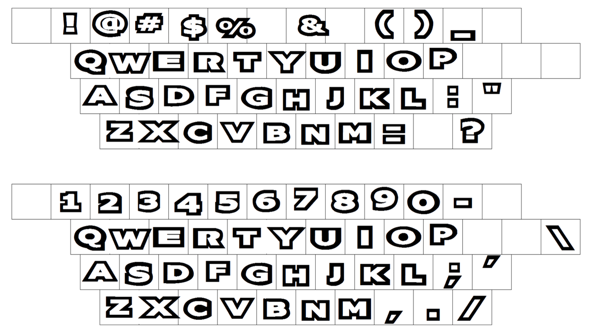
The extra-bold uppercase logotype from the redesigned Oreo badge is set in massive capital letters of a modern sans-serif typeface with traditional shapes of the characters and very thick lines. The custom font has its voluminous letters softened, although the contours and angles of the bars are pretty distinct and strong.
The white and blue color palette of the Oreo visual identity looks fresh and cool, and the blue gradients of the inscription’s shadow add style and progressiveness to the overall look of the badge.


