

![]() Sublime (chocolate) Logo PNG
Sublime (chocolate) Logo PNG
Sublime is one of the favorite chocolate brands in Latin America. It was established in Peru, by one of the most reputable and well-known confectioner labels D’Onofrio, which was acquired by Nestle in 1997. The Sublime brand was a post-acquisition creation.
Meaning and history
![]()
One of the main “sweet” companies on the Latin American market, D’Onofrio, was established in 1859, and named after its founder, Pietro D’Onofrio. For more than a century the company has been producing chocolate, ice-creams, and sweet snacks, and only in 1997 D’Onofrio was bought by the Peruvian daughter of Nestle company. Right after the acquisition, the label introduced Sublime, a new brand of chocolate bars, which has become one of the best-selling chocolate in the region.
Today Nestle Peru has a strong share not only in the country’s chocolate market but on the whole continent. D’Onofrio is still a very significant name in the local market, with its roots and traditions, highly recognizable and respected by the citizens of Latin America.
What is Sublime?
Sublime is the name of a chocolate brand, established by the Peruvian D’Onofrio company at the end of the 1990s. Today the brand is owned by the international Nestle, and has its products distributed in all the countries of South and Central America.
In terms of visual identity, Sublime tends to simple design and friendly smooth shapes, with the logo based on the lettering, which after 2018 started being accompanied by a small bright badge with the name of the mother company, Nestle.
1997 – 2018
![]()
The original Sublime logo was created in 1997 and stayed with the chocolate brand for more than twenty years. It was bold stylized lettering, placed diagonally and underlined in the same style as the bars of the characters. The unscripted was set in a rounded sans-serif typeface with a smooth and deep shade of blue accompanied by small white strokes, which added volume and lightness to the composition.
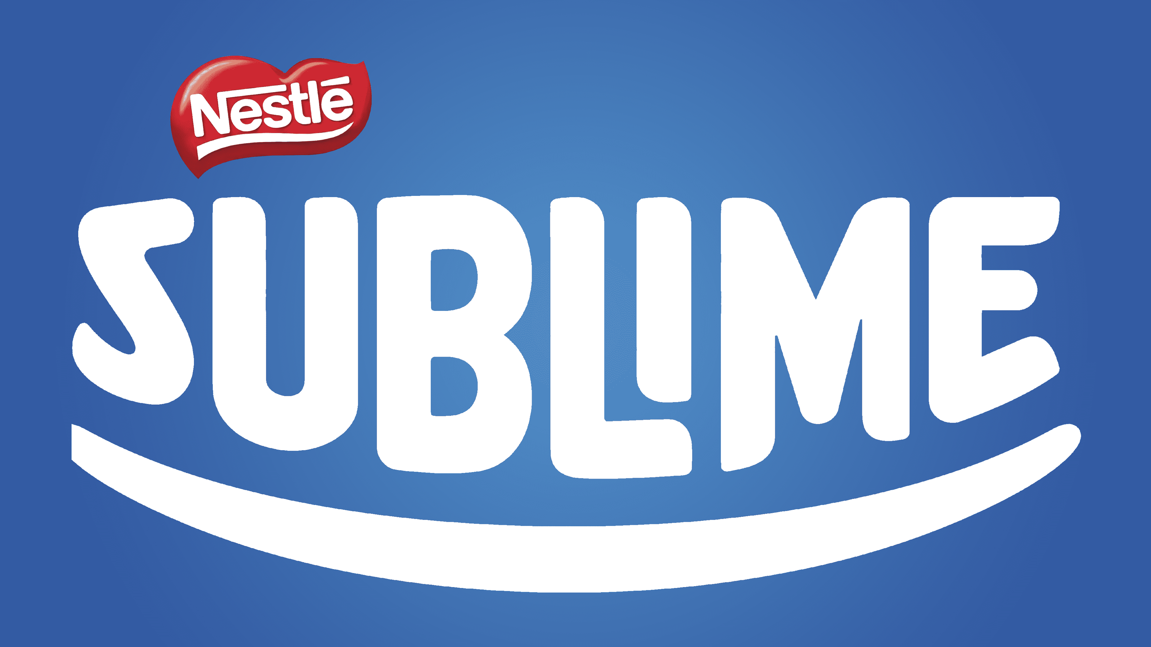
2018 – Today
![]()
The redesign of 2018 has made the Sublime badge look even friendlier. The style of the lettering remained the same, but now the inscription is set horizontally, with the bottom part arched from the center, and the underline creating a kind of a smile. The color of the characters was also refined, with a lighter tone of blue replacing the deep one. The white strokes were removed, and now the inscription looks completely flat, placed against a plain white background. The only bright and voluminous element in the logo is a red Nestle badge, placed in the upper left corner of the composition.
Font and color
The bold and soft lettering from the primary logo of a sublime is set in a rounded sans-serif typeface with thick bars and smooth contours of the characters. The closest fonts to the one, used in this insignia, are, probably, Crowd Funded Regular, or Ravager Sans Regular, but with significant modifications of the contours.
As for the color palette of the Sublime visual identity, it is based on a light shade of blue, which is usually associated with confidence, reliability, and care. While the red stroke is a symbol of love and warmth.


