Finlandia is a brand of vodka produced in Finland from Finnish-grown six-row barley and glacial spring water. The brand was established in 1970 by Alko, Finland’s state-owned beverage company. It is now owned by the Brown-Forman Corporation.
Meaning and history
Finlandia was founded in 1888 by Dr. Wilhelm Juslin, whose vision and expertise in distillation set the foundation for the brand’s excellence. Over the years, Finlandia has not only perfected the art of vodka-making but also established itself as an innovator in the industry. A significant achievement in its history was the introduction of the glacial spring water in its distillation process, a unique feature that distinguished its products in terms of purity and taste.
The company’s journey through the 20th century marked several milestones, including its expansion into international markets and the introduction of various flavored vodkas, catering to evolving consumer tastes. As it stands today, Finlandia holds a prestigious position in the global spirits market. Its commitment to quality, combined with a deep respect for its Finnish heritage, continues to drive its success and popularity among vodka enthusiasts worldwide.
What is Finlandia Vodka?
Finlandia Vodka is a premium spirit brand, renowned for its exceptional quality and distinctive taste. Originating from Finland, the company has gained international acclaim, combining traditional distilling methods with modern innovation. This blend of heritage and progress makes Finlandia a leader in the vodka industry.
1970 – 1998
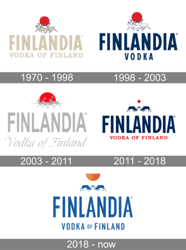
During its inaugural year, the ebony emblem showcased a trio of pristine, white reindeer silhouetted against a dawn’s radiant orb. This sun, resembling a vivid crimson sphere, enhances the intricate antlers of the gracefully galloping creatures. Utilizing the interplay of shadow and lightness, the design accentuates the cool essence of the vessel and its liquid within, giving an impression of a chilled beverage. The label of the brand is also scripted in a luminous hue, signifying the origin of this spirited drink. The typography stretches gracefully, adorned with delicate dots at their zeniths. This subtle touch adds a hint of finesse and elegance to the overall design.
1998 – 2003
Everything about Finlandia logo and its brand design is ice-related. Finland’s Thomas Wirrkala, influenced by ice, designed the bottle in it’s early days setting the precedent for quality and continued inspiration for the bottle design capturing pure natural environment.
The main element of Finlandia logo is a blue wordmark. The font used for the logo is News Gothic Bold Condensed, a realist sans-serif typeface designed by Morris Fuller Benton.
Other premium elements of the logo – the embossed reindeer, the Midnight Sun, an enhanced color palette (blue, red and silver). It’s all is accompanied by the striking copper detailing noting ‘Vodka from the Land of the Midnight Sun’ ensuring the design stands out of the shelf and back bar.
The Finlandia logo has purity at its heart, it represents ice that appears to flow as it turns, and the natural quality of the vodka.
2003 – 2011
Following the creative overhaul, the bottle now boasts a facade resembling thawing ice, accompanied by a matching emblem. This fresh design integrates seamlessly with the original glass vessel aesthetics, rendering the white motifs with a subtle shimmer of silver. The beverage’s moniker is now crafted in more refined, svelte typography. Moreover, an elegant, slanted tagline reading “Vodka from Finland” has been introduced. Another noteworthy addition is the faint horizon line, setting the stage for the sun’s crimson arc to ascend gracefully. This reimagination breathes new life into the packaging, encapsulating the essence and origin of the drink.
2011 – 2018
This logo is bathed in a deep shade of navy. The deer are showcased in a confrontational stance, their horns intertwined, their heads tilted downward, and their forelimbs elevated. Hovering over them is a crimson speck symbolizing the sun. Positioned beneath, there are textual elements: the vodka’s brand name and its manufacturing nation. These annotations are crafted in diverse typefaces: the former in a sans-serif style and the latter exuding classic serif elegance. This fusion of elements and typography paints a vivid picture, capturing the spirit of the brand and its roots, seamlessly blending tradition with contemporary design.
2018 – Today
In the revamped emblem, designers introduced subtle modifications to the typography. The letter “A” now boasts curved edges along its crossbar, while the “F” features a diagonal truncation in its middle segment. The iconic deer remain intact: their horn tips remain interconnected, their heads exhibit a characteristic tilt, A single limb is elevated.
Positioned above them is a crimson sun, now rendered as a half-moon shape, following the decision to omit its top portion. A classic shade of white contrasts brilliantly against a backdrop of deep sapphire blue, adding a touch of elegance to the modernized design. This interplay of elements creates a balanced and memorable visual appeal, reflecting the brand’s evolution while paying homage to its legacy.


