Southern Comfort, affectionately dubbed “SoCo”, is an iconic liqueur marrying whiskey, fruits, and spices. Born from New Orleans’ vibrant spirit, it’s more than just a drink; it’s a celebration of its deep-rooted heritage. Predominantly relished in the U.S., its allure has transcended borders, making a splash worldwide, particularly in Europe. Currently under the wing of Sazerac Company, an esteemed name in the spirits realm, SoCo keeps evolving. While it cherishes its origins, it’s always on the hunt for novel avenues, ensuring it remains a beloved choice for liqueur enthusiasts.
Meaning and history
Emerging from New Orleans’ vibrant heart in 1874, Southern Comfort, often called “SoCo”, was the brainchild of bartender Martin Wilkes Heron. Tired of the inconsistent quality of whiskies back then, Heron decided to mix things up, quite literally. He combined whiskey with a secret blend of fruits and spices, creating a smoother, more flavorful drink.
Throughout the 20th century, Southern Comfort became synonymous with New Orleans’ lively spirit. Its golden liquid captured the essence of the city’s music, food, and fun-loving culture.
Ownership transitions mark SoCo’s timeline. Initially, the brand was independent until it caught the eye of major industry players. In 1979, Brown-Forman, a prominent spirits conglomerate, saw SoCo’s potential and added it to their portfolio. Under their aegis, the brand soared, reaching international markets and becoming a household name.
Yet, as the saying goes, change is the only constant. In 2016, the winds shifted direction once more. Sazerac Company, known for its deep-rooted history in the spirits industry, acquired Southern Comfort. This acquisition was more than just a business move; it was a reunion of sorts, bringing SoCo closer to its New Orleans origins.
Over the years, production methodologies have also evolved. While the brand’s core remains anchored in Heron’s original recipe, innovations have emerged to cater to the evolving palate of the global consumer. From being a whiskey-forward concoction, today’s SoCo emphasizes its unique fusion of flavors, ensuring it appeals to both traditionalists and new-age drinkers.
In essence, Southern Comfort’s journey mirrors a classic tale of innovation, adaptation, and resilience. From a bartender’s experiment in New Orleans to a global sensation, SoCo’s spirit remains undiluted, celebrating its heritage while embracing the future.
Before 2015
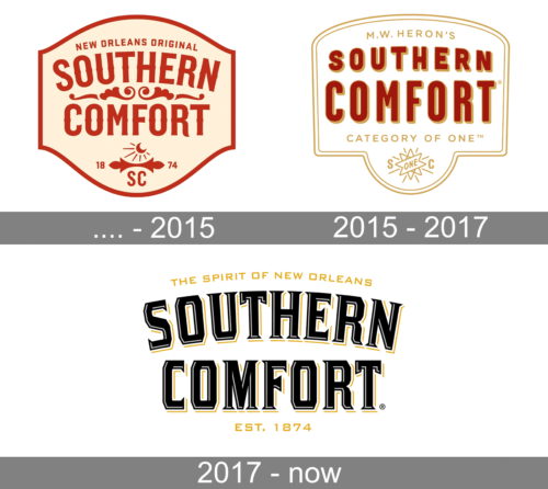
Logo’s shaped like a vintage shield or badge, predominantly in a creamy beige color with contrasting elements in dark red. At the top of the shield, there’s a banner reading “NEW ORLEANS ORIGINAL” in small, uppercase letters. Below the banner, the words “SOUTHERN COMFORT” are written in large, bold, ornate letters. Above the word “COMFORT,” there are decorative swirls adding an elegant touch. Centered at the bottom of the logo is a graphic depicting a crescent moon beside a radiant sun. Right below the graphic, there’s a split banner with “18” on the left and “74” on the right, indicating the year 1874. Beneath this year, the letters “SC” are present, acting as an abbreviation for Southern Comfort. The overall design has a classic, vintage appeal, resonating with the brand’s long-standing heritage.
2015 – 2017
The logo has a shield-like shape with a beige background, outlined with a golden line. At the very top, just inside the border, there’s a text that reads “M.W. HERON’S” in uppercase letters.
The central and most prominent feature of the logo is the name “SOUTHERN COMFORT” written in bold, red letters with a slight 3D effect that gives depth to the letters. The text is large and occupies the majority of the shield’s center. To the top-right corner of the word “COMFORT,” there’s a registered trademark symbol (®).
Towards the bottom of the logo, there’s a phrase “CATEGORY OF ONE™” in smaller, uppercase letters. Below this phrase is a graphic symbol that appears to be a radiant star or sunburst design with the word “ONE” in its center. Surrounding this symbol are the letters “S” on the left and “C” on the right.
The overall design exudes a sense of tradition and premium quality, suggesting the brand’s unique standing and long history.
2017 – Today
The logo is dominated by bold, stylized, block letters spelling out “SOUTHERN COMFORT” in black and gold colors. The word “SOUTHERN” is stacked on top of “COMFORT,” with both words taking up roughly equal space. Each letter in the words is outlined, giving them a three-dimensional effect. Above the brand name, in a smaller, more straightforward font, the phrase “THE SPIRIT OF NEW ORLEANS” is printed in gold. Below the brand name, also in gold, “EST. 1874” indicates the year of establishment. The overall color scheme is primarily black and gold, and a registered trademark symbol (®) is present at the bottom right corner of the logo. The design conveys a sense of tradition and richness, resonating with the brand’s heritage.


