Fábrica de Automóveis Portuguesa (FAP) was a Portugal-based automaker, established by Domingos Sousa. Primarily involved in automobile and commercial vehicle manufacturing, FAP made significant contributions to the automotive sector. Spread across Portugal and having a global market presence, the company was functional from 1921 to 2009.
Meaning and history
FAP, a well-known automaker, was founded by Domingos Sousa in 1921 in Portugal. Known for its diverse automobile and commercial vehicle range, FAP’s prominence rose due to its exceptional quality and design innovation. During its operation until 2009, FAP achieved numerous milestones, including creating landmark models, earning a reputable name in the global automobile industry. As of now, it remains a celebrated part of automotive history.
What is FAP?
Fábrica de Automóveis Portuguesa (FAP) was a renowned automaker in Portugal, operational from 1921 until 2009. It produced a wide array of automobiles and commercial vehicles.
1921 – 1950
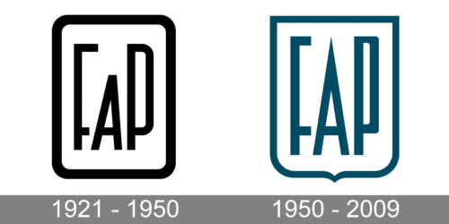
The company was quite innovative when it comes to logo design. In fact, it would be hard to tell that the logo was designed a century ago. It featured a black-and-white color palette and rich thick lines. The font used to print the name resembles Stephanie font designed by Creative Fabrica, only the letter “A” was printed shorter. It almost looks as if the top of the “A” is simply cut off. The name of the company was framed by a line that is slightly thicker than the one used for the letters. The corners were rounded.
1950 – 2009
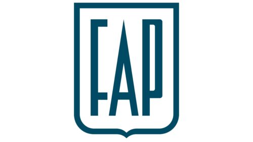
The company modified the logo just a bit. First of all, the color palette was changed to a shade that resembled ocean blue. The rounded rectangular frame was replaced by a frame that had the shape of the shield that had square corners at the top and rounded at the bottom with an element pointing down. The font was changed but it closely resembled the characters in the previous emblem. The main difference was the letter “A”. The top that was “cut off” in the earlier version was brought back, so all the letters were the same height, and the “A” had a pointed top. As with the previous emblem, this logo looks very stylish and modern.


