Facel Vega, a luxury car manufacturer, was once under the helm of Jean Daninos. Originally operating from France, the company primarily focused on crafting exquisite, high-end automobiles. Its operations, spanning from 1954 to 1964, marked an era of unique car designs, blending French luxury with American horsepower.
Meaning and history
Facel Vega was established by Jean Daninos in France, in 1954. Renowned for its luxury cars, the company distinguished itself with American V8 engines embedded in an elegant French design. Its most notable achievement was the HK500 model, lauded for its superior performance and style. However, financial difficulties led to the closure of the company in 1964.
What is Facel Vega?
Facel Vega was a French car manufacturer that operated from 1954 to 1964. Known for luxurious vehicles, the company combined French elegance with American engine power.
1939 – 1961
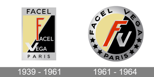
The company used a rectangular emblem for a little over forty years. It had a light gray framing that was wider at the top and bottom and held “Facel” and “Paris” inscriptions. The center portion was split in half diagonally from left bottom to right upper lines. The left portion was done in muted yellow while the right featured black. The full name was printed on the black portion using a light gray color and all uppercase, sans-serif letters. The first letters were made differently with the “F” being extra tall and narrow and done in red with a light gray outline and the “V” being enlarged and featuring bold strokes and light gray color.
1961 – 1964
The previous logo was transformed into a round emblem while preserving the company’s visual identity as much as possible. To make the letters fit the round shape, the designers chose to use only the first letters of the name in the center. They were italicized and made bolder. The font was also changed. The “Paris” inscription was still at the bottom of the logo, but now it curved following the shape of the gray border. It was separated from the full name at the top by three black stars on either. As a final touch, the emblem now had a gradient which gave it a metallic look.


