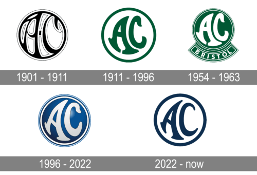
AC is another name of Auto Carriers, an automaking company, which was established in the UK in 1901. The company was established by the Weller brothers at the beginning of the 20th century with the idea of producing classic touring cars, and today it is known for its high-performance sports cars.
Meaning and history

Even though AC Cars was launched more than a century ago, the brand still uses its logo, created in 1907, with just slight changes and refinements. Its circular badge could be seen in different color variations throughout the years, but the smoothness of the lines and playfulness of the letters’ tails is what makes the AC emblem recognizable and memorable.
For the first years after its establishment, the brand was known as Weller, after its founders. In 1904 the name was changed to Autocars and Accessories, and the first auto-carrier was released in the same year. The name AC first appeared in 1908, when the auto-carrier turned into its passenger-version and got the name A.C. Sociable.
1901 – 1911

The original AC badge was created in 1907, for the prelaunch of the new passenger carrier of the company. It was more a draft than a true emblem and featured a circular frame with two “AC” letters enclosed in it. Both frame and lettering were executed in black and boasted a thick white outline. The lines of the abbreviation were arched and curved, and the letters looked very vivid and resembled dancing, which evoked only the happiest feelings and a sense of trust in the brand.
1911 – 1996

The redesign of 1911 cleaned and modernized the contours of the AC logo and switched a color palette, making it sleek and unique. The w badge still featured a circular shape with a confident medium-thick frame and two fancy letters inside, though now the letters were not touching the framed as featured smaller size than on the previous version. Their lines were also modified, and the outline was removed.
The new composition featured a dark green framed with the smooth bold serif letters in the same color, placed in a light blue background. The combination of the lightest shade of blue and dark moss-green looked extremely elegant and sophisticated, showing the brand from its best sides.
1954 – 1963

The previous logo was good and bright, though it was staying with the brand for too long and in 1954 the need for change appeared. The new logo was created based on the previous version, but with some modifications and additions.
The circular emblem became bright green, while the letters turned white and the framing — thin and triple, with two white lines and a green one between them. The “AC” monogram was slightly enlarged, yet they still didn’t touch the frame, just repeating its contours with the bottom lines of the “A”s bars.
The color palette and lettering were minor changes, as for the main one — it was a banner, added under the circular badge. It was arched and outlined in white, repeating the style of the main part. And had an uppercase “Bristol” inscription written on it in white color and a clean bold sans-serif typeface. The lettering was well-balanced and looked like a very logical accompaniment to the AC visual identity.
1996 – 2022

The brand is very constant not only in the high quality of the vehicle it produces but also in its visual identity refreshments, which take place every 40 years. So the next redesign was held in 1996.
The banner was removed from under the circular badge and the green color palette was replaced by dark blue and white. The contours of white letters were emboldened and refined, while the lines of the frame got thickened too. The badge was made three-dimensional, getting gradient shades and flood, which made the surface of the blue circle look like metal.
2022 – Today

The company modernized the logo by removing a gradient and multiple border lines. The shape of the letters was preserved. The background got a solid white color while the initials and the border were a deep blue color. The minimalistic look and the color choice made it look very stylish and reflected the stability and trustworthiness of the company.
Font and color

The AC Cars rarely uses any additional lettering with its iconic circular badge, but if it does, the inscription is usually written in a very simple and laconic sans-serif typeface with medium-thick lines, in black. As for the letters on the badge, they are executed in a custom rounded typeface, which was designed based on the original logo version of the brand and is hand-drawn, with no commercial analogs. The thick smooth lines of the letters and their arched silhouettes look friendly and playful, evoking a very kind and welcoming feeling and at the same time showing the brand as a confident and innovative one.
Until 1996, the brand used various shades of green as the main theme of its visual identity. Green symbolized growth and success and made the AC logo stand out in the list of its competitors. Though after the redesign, the scheme was switched to blue and white, which is a more traditional and calm combination, pointing to the company’s reliability and trustworthiness.


