During the first years of its history (1989-1994), the team was known under the name of Welland Pirates. The choice of name seemed perfectly natural as the club was affiliated with the Pittsburgh Pirates. The words “Seawolf” have also often been used to talk about sailors who engaged in piracy, so the new name didn’t seem to go too far from the original one. The word “Erie” was taken as a nod to the Lake Erie, along which the city is located.
Meaning and history
While the Erie SeaWolves are the Double-A affiliate of the Detroit Tigers, their visual identity bears nothing in common with that of the parent team.
What is Erie Seawolves?
Erie Seawolves is the name of the baseball team from Pennsylvania state, which was established at the end of the 1980s, and today competes in the Minor League Baseball and is managed by Arnie Beyeler.
1995 — 1998
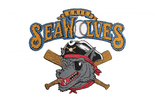
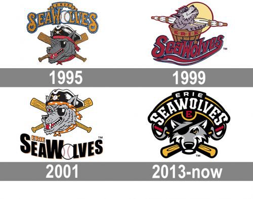
The Erie Seawolves emblem designed in 1995 featured a funny and ornate caricature with a wolf’s portrait in gray and black, placed on a background with two crossed wooden baseball bats. The “Erie Seawolves” lettering was arched above the drawing, and written in a fancy custom typeface in a gold and blue color palette, with the letter “O” replaced by a white baseball. The Wolf was looking like a pirate, in a black tricorner hat with some red accessories.
1999 — 2000
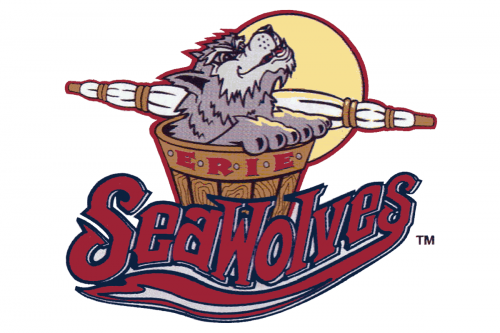
In 1999 the logo for the club was redrawn in brighter shades and with another plot of the image. This time the Wolf in light gray was sitting in a large wooden barrel, with the red “Erie” lettering in the uppercase written on it. The “Seawolves” inscription in burgundy was written in a custom script typeface with thick smooth and elongated lines of the letters.
2001 — 2012
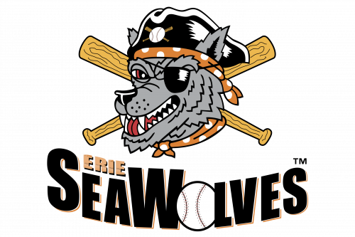 The original Erie SeaWolves logo depicted a wolf wearing an eye patch and pirate hat. Behind him, there were two crisscrossed baseball bats, while the name of the team could be seen below.
2013 — Today
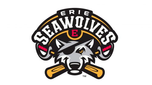 While the overall concept of the second logo is almost the same, its practical implementation is totally different. Once again, we see a pirate wolf, but now its mood is different. While it was overtly aggressive on the original logo, now it seems to radiate cool contempt and defiance. The baseball bats got unusual handles – they look like the handles of sabers or some other weapon of the same type.
Colors
Black, red, yellow, gray, and white constitute the palette of the Erie SeaWolves logo.


