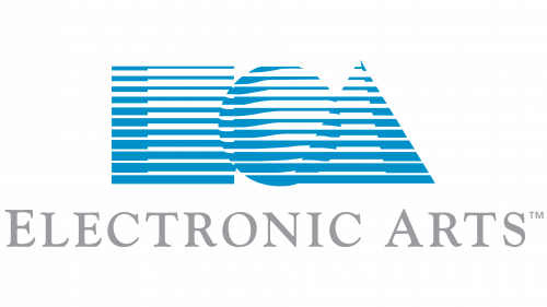
The earliest EA logo was developed by Barry Deutsch from the corporate identity agency Steinhilber Deutsch & Gard. The emblem was dominated by three shapes – a square, a circle, and a triangle.
Meaning and history
EA Electronic Arts were founded by Trip Hawkins, who left his career at Apple as a Director of Strategy and marketing to establish his own business in 1982. And he succeeded, bringing EA company to the heights of the world’s video gaming pedestal.
EA Electronic Arts is a digital interactive entertainment company that designs, publishes, and sells them. Company games are available on different platforms – from personal computers to phones and tablets running on both iOS and Android operating systems.
EA Electronic Arts’ best-known brands are Apex Legends, Battlefield, The Sims, Madden NFL, Star Wars, and FIFA Ultimate Team. The company promotes and sells its games and services through retail and digital distribution channels. Its PC games and additional content can be downloaded directly through the online Origin platform, as well as through third-party online download stores such as Steam.
What is EA Electronic Arts?
EA Electronic Arts are the world leader in interactive entertainment software, which was established in the United States in 1982. The company was established by Trip Hawkins from Apple, which is already a sign of quality. Today EA is known all over the globe as a developer of super popular video games.
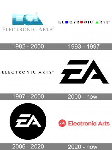
1982 – 2000
The square was supposed to represent an “E,” the triangle was an “A,” while the circle stood for the globe as the symbol of the company’s international aspirations.
Interestingly, there was also another explanation of the circle on the initial logo. There was a small problem in the computer program that placed the ball in the logo. Even when the designers tried to get rid of it, the ball would keep popping up. By the way, the same ball would pop up in the earlier version of the games published by the company.
Anyway, for a person who didn’t know much about the company and its ambitions, it was hardly possible to grasp the meaning. Even if she managed to understand that they represented letters, she would read them as “EOA.”
We should add that blue is highly associated with networks, communication, and mental processes, so it seemed perfectly appropriate in this emblem.
1993 – 1997
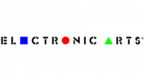
With time, though, the company decided to get rid of the watercolor palette in favor of a more contrasting color scheme and make the shapes more meaningful. In 1993, the pale blue and grey of the original logo were replaced by vivid blue and green, bright red, and black. Also, in this version of the Electronic Arts logo, the large shapes from the previous emblem grew small and flat. What’s even more important, they were now incorporated in the wordmark, where they replaced letters: the square represented the “e,” the circle represented the “o,” while the triangle stood instead of the “a.”
1997 – 2000
The version, created for the company in 1997, was full of elegance and excellence. It was a solid black lettering, written in the uppercase of a chic and classy serif typeface against a plain white background without any graphical additions. The main eye-catching elements of this laconic badge were the sharp elongated serifs on the ends of the distinctive bars.
2000 – Today
The logo introduced in 2000 was inspired by that of EA Sports, a sub-brand of Electronic Arts. There were only two large letters, “E” and “A,” in a creative type.
2006 – Today
The redesign of 2006 has introduced the stylized EA monogram, created for the company in 2000, in a new way. Now it is set in bold white lines with straight sharp cuts, and placed inside a solid black roundel. The same typeface, and the same color palette, but a completely different look of the logo, with a stronger backbone and more confidence.
2020 – Today
The redesign of 2020 brought a sharp and progressive image to the Electronic Arts visual identity. Though it is fully based on the previous monochrome version, the addition of the lettering and the new color palette — coral red on white — made it look lighter yet showed the character of the brand and added uniqueness. Now the solid coral circle with a stylized white monogram is accompanied by a simple yet modern and strong sans-serif “Electronic Arts” inscription on its right. The clean straight lines of the logotype balance the sharpness of the monogram and make the circular shape of the badge more confident.
Font
Both the large letters were custom made for the company. If you want a similar-looking type, you’ll find it under the name of “EA logo font” in the libraries of Befonts. This font inspired by the EA wordmark was created by 538Lyons and Behance.
Also, the emblem of EA Sports features a different type for the word “Sports.” It’s a custom square sans called EA Sans Bold.
Colors
The combination of black and white featured on the Electronic Arts logo fits any background.


