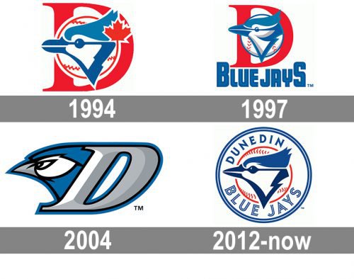
While the franchise has been known under its current name since in 1987 and its logo has always featured a blue jay bird, it doesn’t mean that the logo actually remained unchanged.
Meaning and history
The logo of the Dunedin Blue Jays is heavily based on that of the Toronto Blue Jays, which is its parent team.
1994 — 1996
 The 1994 Dunedin Blue Jays logo features a side view of the blue jay over a baseball and a large red “D.”
1997 — 2003
 The red maple leaf featured on this logo disappeared in 1997.
2004 — 2011
 Instead, the lettering “Blue Jays” in blue was introduced. On the 2004 emblem, the bird moved to the left, while the “D” was colored grey.
2012 — Today
The Dunedin Blue Jays logo was introduced simultaneously with the new brand identity for the parent team, the Toronto Blue Jays, and it looks almost the same. The most notable difference is the absence of the maple leaf. The word “Toronto” has been replaced by “Dunedin.”


