CyberPower logo may appear slightly cluttered, it is energetic and eye-catching. The design conveys the “power” theme creating a link with the name of the company.
Meaning and history
CyberPowerPC is one of the most well-known and reputable names in the global online- and video-gaming industry, as the company is specialized exclusively in the production of personal computers for gaming. The main thing about this brand is that they implement all the latest trends and technologies into their products, at the same time trying to make them affordable and easy-to-use.
Another reason for the CyberPowerPC company among gamers is that their computers are produced to the user’s specifications and preferences. There are basic packages, which can be modified and extended, depending on the needs of the client.
What is CyberPowerPC?
CyberPowerPC is an IT company from the United States, which was established in 1998, and is focused on the manufacturing of computers, suitable for gaming. This privately-owned company, based in California, has been taking leading positions in the lists of the fastest-growing businesses since its first days.
2004 – 2009
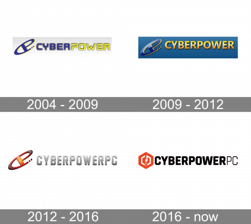
The CyberPowerPC logo, designed in 2004, was composed of a stylized monogram-emblem, followed by the logotype, executed in a bright blue and yellow color palette. The diagonally placed emblem featured a capital letter “P” inscribed into an extended “C”. As for the lettering, it was written in the uppercase of a futuristic sans-serif typeface, with the bold letters in blue and yellow shadowed.
2009 – 2012
The redesign of 2009 has kept the composition of the previous badge, making it three-dimensional and reworking its color palette. The emblem was now set in glossy gradient blue, with a thin yellow outline, and placed over a calm blue rectangle, on the left from the yellow voluminous logotype, written in all capitals of a modern and bold sans-serif font.
2012 – 2016
The color palette of the CyberPowerPC visual identity was changed again in 2012. The blue background was gone, and now the emblem in dark red gradients was set on a transparent background, on the left from the geometric sans-serif inscription in light silver. The gradient silver letters of the logotype were slightly shadowed, which made them look brighter when placed on white.
2016 – Today
Like many other modern logos, this one consists of two parts: the emblem and the wordmark.
The emblem features a red hexagon with rounded corners. Inside, there is the lightning bolt and a white hexagon. In many cultures, the lightning bolt has been the symbol of power with the thunder god being the most powerful god. So, the emblem’s connection with the word “Power” in the name of the company is obvious.
The wordmark can be broken down into two unequal parts. The writing “CyberPower” is bold and therefore better legible. The letters “PC” are thinner. The difference in the type has been used to create a visual border between the parts of the company’s name.
There is more than one possible way to position the emblem and the wordmark. For instance, on the company’s official website, the emblem is positioned to the left of the wordmark. Another popular approach is to place the emblem above the name of the company. In this case, the emblem grows larger and looks more prominent, it is easier to make out the details.
The version with the large emblem seems to introduce a clearer vision of the brand’s identity. When it is smaller, the lightning bolt is less visible, which makes the primary message of the CyberPowerPC logo somewhat blurred.


