

![]() Blackberry Logo PNG
Blackberry Logo PNG
BlackBerry is an iconic brand of mobile phone manufacturer. It was founded in 1999, with the launch of pager BlackBerry 850. The brand uses Android operational system and is owned by the Chinese TLC company.
Meaning and history
![]()
The company has chosen the “Apple path” in creating the brand’s name. BlackBerry has nothing in common with the industry the company work in, just a word, just a brand.
There is a legend though, that the name came out when someone said the buttons on the phone resembled the blackberry seeds.
The BlackBerry logo is memorable and recognizable. It is a wordmark in a bold custom typeface and a famous BlackBerry emblem.
What is Blackberry?
Blackberry is the name of a Canadian mobile phone manufacturer, which was established at the end of the 1990s, and for quite a long period has been known as the main Apple competitor. The brand is mainly known for its smartphones with Android OS.
1999 – 2004
![]()
The very first logo for Blackberry was introduced in 1999 and featured a pretty simple and modest composition, where the dark red and black lettering was placed under the graphical element in smooth black lines.
The inscription was executed in a narrowed italicized sans-serif typeface, in all capitals, with the “Black” part in burgundy red and “Berry” in black.
As for the graphical part, it was a contoured envelope image with an elongated curved line coming out of it and “covering” the logotype.
2004 – Today
![]()
The redesign of 2004 brought the new image to the Blackberry visual identity, and this style became iconic. The new logo is executed in a monochrome color palette with an abstract geometric emblem placed on the left from the lettering. The emblem is composed of seven solid elements with the right sides arched and the left ones — flat. The new typeface of the logotype boasted sleek shapes with rounded angles and clean contours.
The Emblem
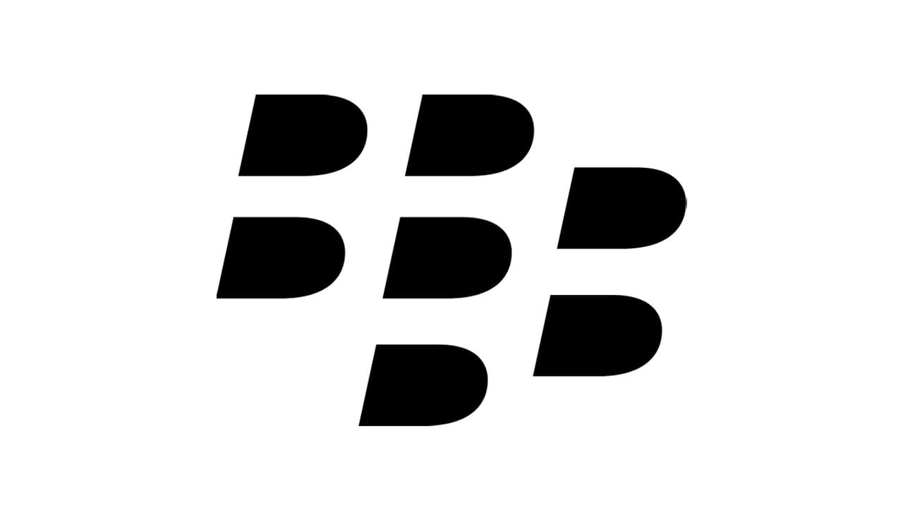
The BlackBerry emblem is composed of seven D-shaped figures, located on three columns 2-3-2. Figures in the first and the third columns form two letters “B” in negative space. B for Black and B for Berry.
Another symbol of the emblem is blackberry berry itself – the D-figures resemble the fruit’s texture.
The Wordmark
![]()
The wordmark is executed in custom grotesque typeface, which is close to Nimbus Sans Bold. It is italicized, which adds elegance and sophistication to the nameplate.
The two letters “B” of the wordmark with their cut off bottom angles make the lettering unique.
The monochrome palette of the logo seems to be more than a logical choice. It accents the lines of the typeface and makes the emblem stand out like a piece of modern artwork.
Font and Color
The stylish italicized lettering from the primary BlackBerry logo is executed in a custom sans-serif typeface, which looks very energetic and strong due to the use of slanted characters. The logotype is set in a designer font, which is something in between Internacional Bold Italic and HongKong Medium Italic.
As for the color palette of the Blackberry visual identity, it is set in monochrome, with all elements drawn in flat black against a white background. This scheme not only graphically represents the name of the brand, but also shows the professionalism and stability of the brand, being a symbol of quality and expertise.


