Cinzano is an Italian brand of vermouth, first introduced in 1757 by two brothers, Giovanni Giacomo and Carlo Stefano Cinzano. The vermouth comes in four versions: Cinzano Rosso, Cinzano Bianco, Cinzano Extra Dry and Cinzano Rosé. The brand is owned by Gruppo Campari since 1999.
Meaning and history
The Cinzano logo is bright and fresh. It’s bold silver wordmark contrasts beautifully with red and blue background geometry. Block lettering and a distinctive “Z” taller than the rest make the Cinzano logo very recognizable. Silver is also used for the rounded rectangular logo frame.
The Cinzano logo color scheme hasn’t changed much during the brands history, unlike its icon. For a significant period of time Cinzano logos featured heraldic motives. Since 1929 its icon was a lions head. The lion first looked right, then left, then was redrawn and stylished several times.
1914 – 1920
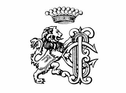
The original Cinzano logo was introduced in 1914 and featured a traditional heraldic image with a lion rampant standing on the left from the classy gothic-style monogram. There was also an enlarged crown placed above the composition with its nine peaks embedded with massive spheres.
1920 – 1921
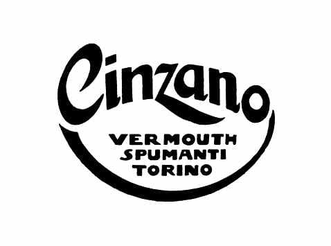
The redesign of 1920 brought a contemporary and bold text-based logo to the Italian brand. It was a thick black “Cinzano” inscription executed in a fancy font with some lines elongated and curved. The nameplate was arched above the “Vermouth Spumanti Torino” set in three lines of bold sans-serif capitals. The whole badge was underlined by a smooth line, arched down from the center and creating a framed with the “Cinzano” as the upper border.
1921 – 1929
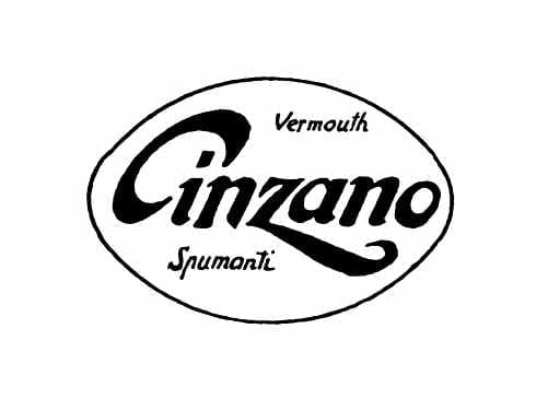
In 1921 the nameplate was set in a straight line and enclosed into a horizontally oriented oval frame with thin borders. The “Vermouth” was placed above the “Cinzano” lettering, and the “Spumanti” — under it.
1929 – 1974
The logotypes which became a basis for the current iconic emblem was first introduced by the brand in 1929. It was an uppercase bold black inscription executed in a strong modern sans-serif typeface with the letter “Z” in the middle enlarged.
1929 – 1935
The logo from 1929 was a combination of two versions — the original one and the one from 1929. The lettering turned white and got placed on a black rectangular banner in a thin double frame, and on the left, from it, there was a contoured lion rampant emblem with the monogram and crown.
1935 – 1957
The color first appeared on the Cinzano emblem in 1935. It was when the white logotype got placed on a purple and red rectangular banner, which was visually diagonally separated into two triangular parts. The whole badge was outlined in bright yellow, which made it stand out and be memorable.
1957 – 1966
The redesign of 1957 removed the yellow outline and elevated the colors of the rectangle. Now the composition featured a dark blue triangle at the upper part of the badge and intense red, closer to burgundy, on the bottom. The white logotype remained untouched, being the main part of the emblem.
1966 -1974
In 1966 the logotype turned red and the background was removed, so the red letters were placed directly on white. The white was also in the letters’ bodies — thin lines were coming through all the symbols, repeating their contours and making the whole inscription lighter and more individual.
1974 – 1990
The Cinzano logo, introduced in 1974, featured a completely different structure and style. This badge, composed of an italicized blue lettering and a red stylized lion’s head above it, stayed with the brand for sixteen years and was a representation of the company’s progress and ability to change.
1990 – 2000

In 1990 the badge from 1935 returned to the Cinzano visual identity, being refined and modernized. The new badge was outlined in gold and had its blue and red colors intensified and cleaned. The white lettering was slightly enlarged, keeping its iconic typeface and shapes of the letters.
1990 – Today
The monochrome version of the logo, introduced in 1990, is still used by the brand today. The logotype turned black and got placed inside a white rectangle in a thin double frame, with a dot-contoured lion emblem from the very first Cinzano logo. Despite its black and white color palette, the emblem looks fresh and sophisticated.
2000 – 2009

The contours of the badge, created in 1990, were refined in 2000, making the iconic blue and red emblem event stronger and more stylish. The combination of these shades, complemented with a delicate gold frame, made the brand look elegant and chic, and its product — luxurious and one of high quality.
2009 – Today

The badge from 2000 was refined in 2009. The blue and Ted rectangular, with the shades darkened, was slightly arched, while the gold outline was replaced by a three-dimensional silver one, which is a bit thicker. The lettering got its shapes refined and outlined in a thin black with a narrow dark shadow.
The current Cinzano logo represents tradition in modern interpretation as well as Italian pride, characterizing the brand.


