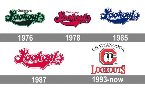
One of the oldest minor league baseball clubs, the Chattanooga Lookouts played their first official game in 1885. They have been playing over 130 years under their current name, with the only exception of the 1943/44 playing season.
Meaning and history
The Chattanooga Lookouts have been rather consistent in their brand identity, at least throughout the last half a century. Since 1976, their logo has experienced only one major overhaul.
1976 — 1977
The logo, created for the Chattanooga Lookouts in 1976, only stayed with the club for a year but became a strong basis for several following emblems. It was a bold script “Lookouts” wordmark in bold, wide, and smooth lines, with distinct cuts and sharp angles. The lettering was placed on a bright green background, which was repeating the contours of the inscription. The “Chattanooga” was written above it in smaller letters, in black.
1978 — 1984
The redesign of 1978 was all about the changes in the color palette of the Chattanooga Lookouts visual identity. The black script lettering remained untouched, but the green background was switched to dark blue and got cut in size, so the outer borders of the wordmark were only slightly outlined by blue. The “Chattanooga” above the main logotype was now set in red too, though the typeface and size of the inscription remained untouched.
1985 — 1986
The additional “Chattanooga” inscription was removed from the Lookouts visual identity in 1985. The new color palette was composed of blue and white, where the blue script logotype was set on a white background and outlines in white and thin blue. It was a fresh logo, which looked much more modern than the two previous versions. The new badge was evoking a sense of professionalism and confidence.
1987 — 1992
The exquisite navy blue color was replaced by a bright red in 1987. The logo in this new palette stayed longer than others from the script era of Chattanooga Lookouts’ visual identity. No other changes were made to the badge. It was the brightest and the last of the original Lookouts’ badges.
1993 — Today
 The following version emphasized the “lookout” theme even more. Now, the emblem featured a capital “C” with two eyes.
Colors
The palette of the Chattanooga Lookouts logo comprises red, black, and white. White dominates the emblem, and because of this, the design looks rather light and unobtrusive.


