

![]() Kannapolis Intimidators Logo PNG
Kannapolis Intimidators Logo PNG
The Minor League Baseball team the Kannapolis Intimidators is a Class Low-A affiliate of the Chicago White Sox. The current brand identity, including the name and the logo, was adopted in 2001.
Meaning and history
![]()
The history of the franchise started in 1963, but it was only in 1995 that the team moved to Kannapolis from Spartanburg, South Carolina, and played its first official game in the South Atlantic League.
![]()
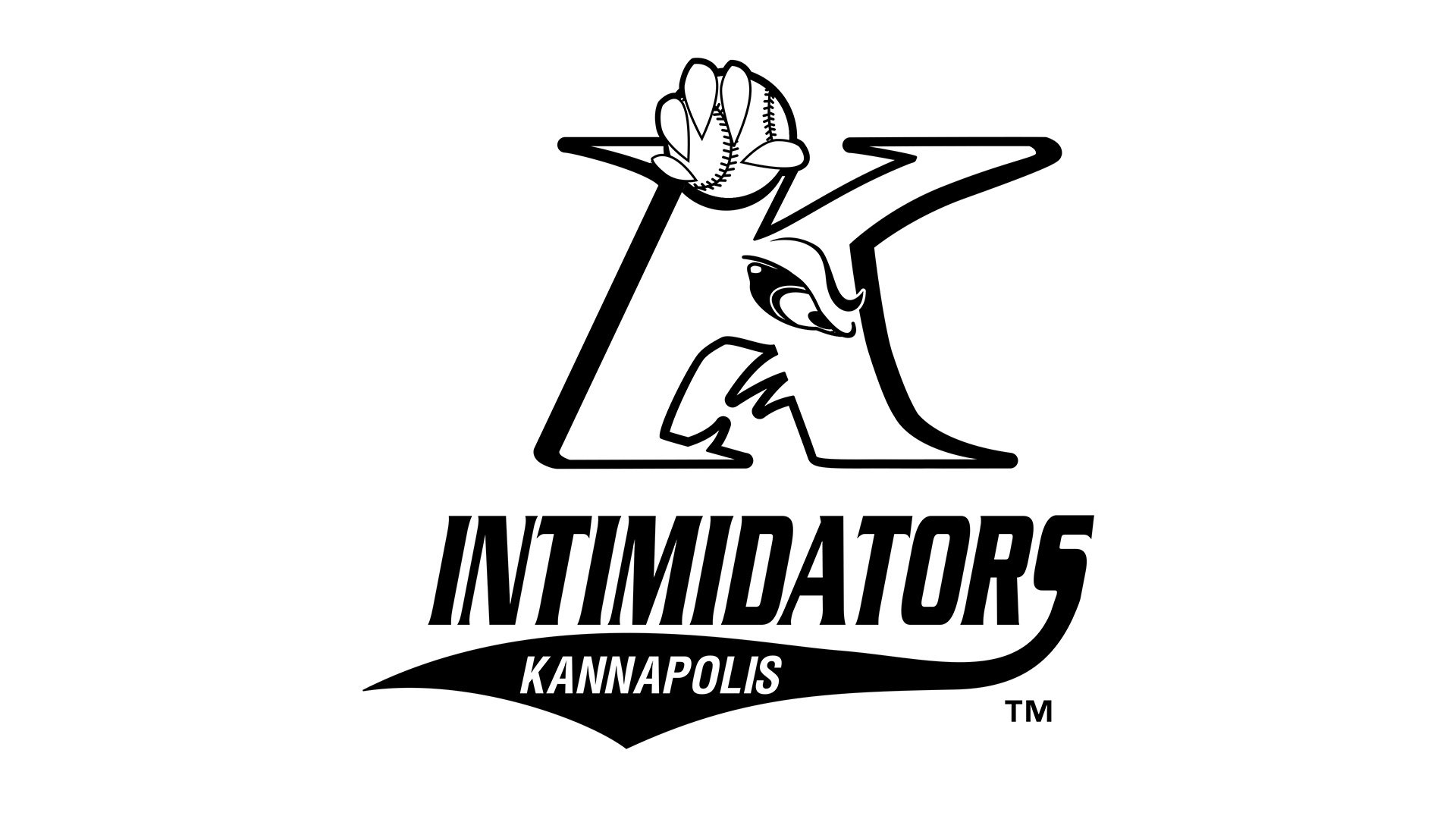
Primary symbol

The large “K” that is the focal point of the Kannapolis Intimidators logo isn’t just a regular letter – it looks more like a muzzle of a fierce animal. There’re sharp teeth and an angry eye. On the top, you can see sharp claws holding a baseball.
Colors
The white letter with the black and red outlines is featured on the white background. For the cap insignia, the team chose the same logo with a different background color.


