Changan Automobile Group, the moniker synonymous with China’s automotive behemoth, stands prominently as the third-largest automobile titan in the nation. As a government-controlled establishment and an affiliate of China South Industries Group, the organization is the brainchild of the Private Engineering Corporation and originates from the thriving urban hub of Chongqing.
Meaning and history
Changan, a term that conveys the concept of “enduring security” in the Chinese language, is the appellation of an automobile enterprise that took root in Chongqing, China, in 1862. Initially, the company served as a state-run ordnance factory, fabricating military apparatus for the Chinese military. As time progressed, it branched out into the automotive sector, establishing itself as a significant player in the Chinese automobile marketplace.
At present, Changan stands tall as one of China’s premier automakers, crafting an assortment of transportation means that encompasses cars, trucks, and buses. The company holds a worldwide presence, with operations in over 60 nations and territories, and has formed alliances with notable carmakers such as Ford and Mazda.
Changan’s focus lies firmly on innovation and sustainability, as it endeavors to devise electric and hybrid automobiles. The enterprise has garnered a plethora of accolades for its groundbreaking efforts in these domains and remains a driving force in China’s automobile industry.
What is Changan?
Changan, the sizzling nickname for China’s automotive mammoth, Changan Automobile Group, stands tall as one of the most considerable auto giants in the nation. As a government-powered entity and a subsidiary of the China South Industries Group, the firm is the brainchild of the Private Engineering Corporation and hails from the bustling metropolis of Chongqing.
Since 1862, Changan has been the driving force behind the manufacturing of cars, trucks, commercial vans, and minibusses. Two of its unique brands, Chang’an and Chana, enjoy a cult following.
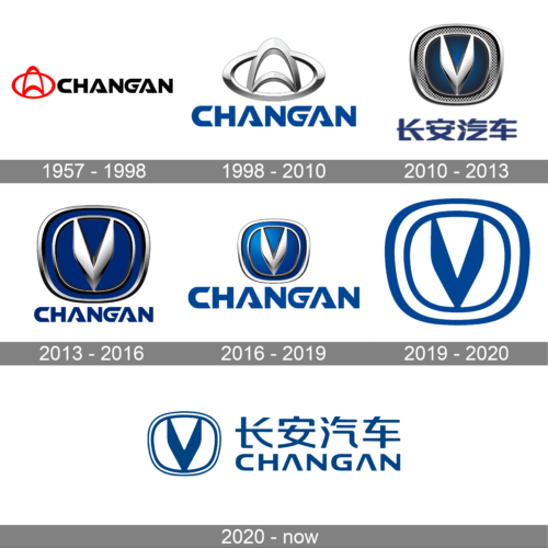
1957 – 1998
The firm’s foremost logotype was a dual arch rising in a curve, enclosed in a crimson oval, and conjoined at the tips to the underlying figure’s lower boundary. This overlapping arrangement created the impression of an aperture in the band, giving rise to four ivory voids, partitioned by scarlet lines of diverse shapes.
Adjacent to the sign, letting in uppercase letters of black hue bore the label moniker, either in English or Chinese. Each character was skewed and elongated, with round edges, while some, like the note “A,” boasted a unique layout, resembling an isosceles triangle with a lower stripe.
1998 – 2010
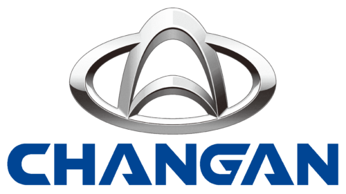
The makers of the insignia opted for an alteration, injecting the insignia with a three-dimensional aspect, brought to life by an impeccable blend of shading and brightening on the gray tones. While preserving the arch’s original contour, the stripes underwent a broadening process, and the same tactic was applied to the oval shape.
The lettering went through a complete overhaul, featuring chic, curvy, and slanted angles. The note “C” acquired pointed tips, while the triangular “A” sported a truncated base (instead of the traditional crossbar). The “G” was reimagined with a diagonal right flank. The creators discarded the black tint of the characters and replaced it with a captivating blue hue.
2010 – 2013
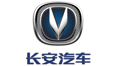
The logo presented is a rectangular emblem with a thick silver border that frames a dark blue background. In the center of this rectangle stands a stylized silver letter “V” with a metallic sheen, suggesting a merger of tradition and modernity. The “V” could symbolize victory or refer to a pivotal element of the brand’s identity. Surrounding the “V” is a pattern reminiscent of a chain link, which might represent interconnectivity and strength. Below the central figure, the logo features Chinese characters in white, which contrast sharply against the blue background, likely representing the brand’s name or slogan in its native language. The overall impression is one of robustness and reliability, traits desirable in the automotive industry.
2013 – 2016
This logo simplifies the design by focusing on the central elements. The outer rectangle is removed, giving way to a round shape that feels more global and encompassing. The “V” remains prominent and adopts a bolder look against a gradient blue background that suggests depth and dynamism. The silver border now transforms into a circular frame with a grille-like pattern, invoking the grille of a vehicle and symbolizing industry and engineering. Below the symbol, the brand name “CHANGAN” appears in capital western letters, conveying a more international appeal. The design is cleaner, with more emphasis on the “V,” which now more clearly stands as the face of the brand.
2016 – 2019
The symbol underwent a complete metamorphosis, with the creators deciding to turn the symbol on its head, fashioning an upended arch that took on the form of a broad “V,” resembling a pair of wings in mid-flap. The oval portion was elongated, sculpted into a ring-like figure, with a slight narrowing at its lower section, encased in a trapezoidal edging, all of which exhibited an immersive, three-dimensional aspect. The entire composition was set on a captivating blue backdrop, replete with gradient shifts, and the wording remained intact, unaltered in its essence.
2019 – 2020
In this logo, there is a notable shift to minimalism, with a solid blue background that exudes confidence and stability. The “V” is more pronounced and takes center stage, shedding the complex chain design for a simpler, more streamlined look. It maintains its metallic texture, which reflects innovation and modern manufacturing processes. The ring encircling the “V” is now smoother and uninterrupted, giving the logo a more unified and harmonious appearance. The absence of Chinese characters in the emblem suggests a brand that is self-assured and focused, ready to be identified easily across global markets. This evolution reflects a brand that has matured, simplifying its logo to make it more iconic and recognizable.
2020 – today
The current logo follows the trend of contemporary 2D style emblems, adhering to a simplistic and unadorned aesthetic. The designers excised extraneous embellishments, unburdening the emblem’s visual aspects. Yet, they retained its essential elements: the “V” letterform, the trapezoidal frame, and the double border, ensuring its unmistakable identity.
Color
The logo’s color palette is a study in simplicity, featuring a breathtaking blend of deep blue and white. Once upon a time, the color scheme comprised black, red, and an array of gray shades. But those colors are a thing of the past. The current shades are utterly captivating.
Font
The lettering features a bespoke font, characterized by an unconventional “A” that takes the shape of a triangle, with its crossbar lowered to create a sharp edge. The letter “G” sports a diagonal cut on its right side, adding a touch of asymmetry to the overall design.


