Carling is the most popular beer brand in the UK, was founded in Canada in 1840. Since 2005 Carling label is owned by Canadian Molson Coors Beverage Company.
Meaning and history
Carling is an English beer with Canadian roots. The brand ranks first in sales in the UK and is hugely popular in South Africa. The brewery is located in the brewery capital of the country, Burton-on-Trent.
The history of the Carling brand began in 1818, when Yorkshire farmer Thomas Carling opened a small brewery in the Canadian town of London, Ontario. Only six workers brewed ale at the enterprise, and the owner sold the drink on the streets from a mobile cart. Production gradually expanded, and in 1878 Carling’s sons built a six-story brewery in the center of the city.
The company was named the W & J Carling Brewing Co. but did not remain family-owned for long. After the death of the first owner in 1911, the company has changed its owners several times. In the early 1950s, Carling beer appeared in Great Britain, and by 1980 the brand was at the top of sales in the country. Today it is one of the best-selling brands not only in Canada but also in Great Britain.
What is Carling?
Carling is the name of a famous Canadian beer brand, which was established in 1840. For the most part of its history, the brand was only known in North America, but after its acquisition by Canadian Molson Coors Beverage Company in 2005, Carling products have conquered the international market.
1990s – 2011

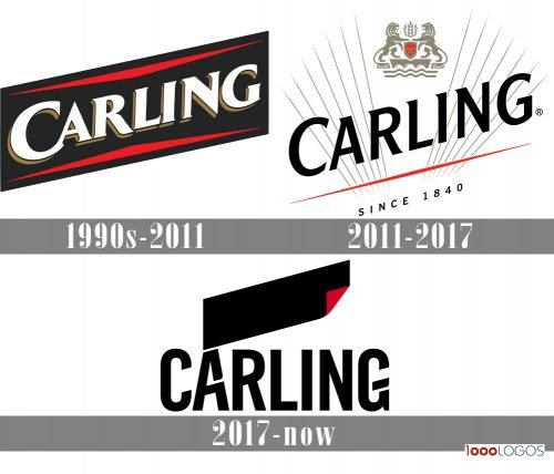
The original Carling logo was introduced at the beginning of the 1990s, boasting a sleek black diagonally oriented rectangle with a shadower serif lettering in white and gold and two thick red lines, placed in parallel to each other, along the upper and bottom sides of the banner. Though the nameplate was written in the uppercase, its first letter, “C”, was enlarged relatively to other letters, and had its tail merging with the bottom left part of the next “A”. The red lines were emboldened in their middle parts, which made them look like super stretched arrow-heads, pointing to the middle, where the wordmark was set.
2011 – 2017

The redesign of 2011 changed everything in the Carling logo, except for its diagonal orientation and its color palette. The new emblem featured thin modern lettering in all capitals, written in black, and underlined with a thin red stroke. The underline was crossed by 14 extra-thin silver rays, which were directed up and to the sides, resembling a sun or a silver crown. On the white space between two groups of the rays, there was a classy royal crest, which had a red shield with two silver rampant lions on the sides. Another feature of the new logo was a black “Since 1840” tagline in all capitals of a traditional sans-serif typeface.
2017 – Today
The Carling logo was completely redesigned in 2017 by London based BrandOpus bureau. The bureau created a special typeface and named it Carling regular. The new font is based on Trade Gothic Bold Condensed No 20.
The lead role in the new Carling logo is given to a black parallelogram with red corner and the wordmark, executed in raisin black.
Silver, white, black and red are the main brand colors. There is also a touch of gold, but only on Carling Apple cider packaging.
Before the redesign, Carling was mostly recognized by white and silver lion’s head logo, which was inspired by heritage car emblems.
The new logo is simple and minimalistic yet modern and stylish.
The Carling logo is a brilliant example of “the less — the better”, and its minimalist logotype with just a few customized details looks extremely strong and modern. The sans-serif typeface of a capitalized nameplate is based on one of the traditional fonts, such as Alternate Gothic ATF Demi, Chairdrobe Rounded Bold, or TV Nord EF Cond Bold, but has the contours of its “A” and “G” diagonally cut with white lines, which makes them unique and creates a lighter feeling, adding sophistication and freshness to the solid wordmark.
Font and Color
The black and red color palette of the Carling logo is a perfect choice for the contemporary lettering and geometric emblem. This combination evokes a sense of power and brutality, along with timeless elegance and passion. Black stands for stability, while a touch of red points on the progressiveness and positiveness of the brand, which is ready to grow and change with the needs of its audience and the latest trends.


