Burn is an American brand of energy-beverage, established by Coca-Cola in 2001. The drink under this label is sold in almost 100 countries across the globe is produced in several different flavors.
Meaning and history
The Burn visual identity is bright, strong and modern, as well as the brand’s name. It is composed of a wordmark with an emblem above it.
The nameplate in all the lowercase lettering is written in a sans-serif stencil typeface, which is bold and slightly narrowed. There is also a tagline with a small brand’s signifier. “Energy Drink” in all capitals is executed in a simple sans-serif typeface with straight lines.
The Burn signifier is a black vertical curved line on a solid white circle. It looks clean and neat, balancing the sharp and contemporary emblem.
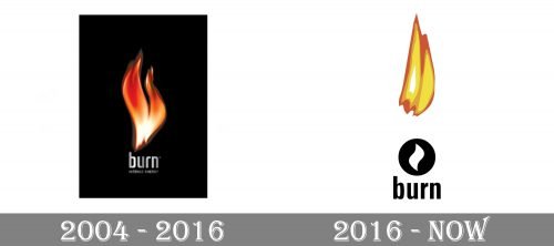
2004 – 2016

The original logo, created for the beverage brand in 2004, featured a dark yet bright and memorable composition, where the sleek three-dimensional image of a flame was set vertically above the lowercase lettering with a delicate tagline. The flame had a light blurred outline which made its contrast with the solid black background softer.
As for the inscription, it was written in the lowercase of a narrowed sans-serif typeface with bold neat lines. The “Intense Energy” tagline was written in all capitals of a thinner and more traditional font, with laconic and simple straight lines. Both parts of the inscription featured a gradient silver shade, which resembled cold metal, thus the whole logo became a representation of fire and ice mix, which brilliantly depicted the concept of the brand.
2016 – Today
The Burn emblem is a flame. Vertically elongated it starts above the letter “U” of the wordmark and it’s pointed peak almost touches the top edge of the square frame.
The Burn logo is contemporary and powerful. It has a masculine brutal character and represents the free spirit of the brand’s audience. The reflection of energy and power, it looks perfect on the products’ packaging and on the websites. Bright, laconic and brave.
Current emblem
The brand’s website features a “hotter” version of the Burn logo. This time, the designers have made the fire larger by adding more flames. They look more realistic due to the larger number of details.
The type is completely new – a capitalized serif one. It is filled with a fire pattern.


