At the heart of the American motorcycle industry stands the iconic Harley-Davidson, a brand synonymous with tradition, power, and an unmatched road presence. Established in Milwaukee, Wisconsin, this legendary manufacturer has carved out a niche that resonates with the spirit of freedom and the open road. Harley-Davidson operates with a commitment to quality and craftsmanship, ensuring each of their bikes — from the classic Heritage Classic to the adventure-ready Pan America — embodies the essence of the brand’s storied history. With a network of dealers across the globe, Harley-Davidson ensures the availability of its motorcycles, apparel, and accessories, catering to the passionate community of riders and enthusiasts who share a common love for the open road.
What does the Harley-Davidson logo mean?
The Harley-Davidson logo, a globally recognized icon, encapsulates the essence of freedom and power, qualities intrinsic to the brand’s identity. It has undergone numerous changes since the company’s inception, each version reflecting the evolution of this iconic brand. The current black and orange theme, embodying courage and passion, is not just a symbol but a badge of honor worn proudly on merchandise, from t-shirts to jackets, connecting the vibrant community of real people who share a love for the road. This logo transcends the bounds of being merely a corporate emblem; it represents a lifestyle, a testament to Harley-Davidson’s commitment to building powerful engines and motorcycles that offer an unparalleled sense of freedom.
Meaning and history
The foundation of Harley-Davidson in the early 20th century by the Davidson brothers and William S. Harley in Milwaukee was the start of what would become an iconic symbol of American freedom and innovation. The early days saw the creation of the first Harley-Davidson motorcycle, setting the stage for a legacy of engineering excellence. As the company navigated through the Great Depression, it solidified its place in the hearts of American riders, symbolizing resilience and the pursuit of adventure.
Harley-Davidson’s history is marked by significant achievements, including the production of military motorcycles during both World Wars, enhancing the brand’s reputation for reliability and strength. The introduction of models like the Electra Glide and the Street Glide represented milestones in motorcycle design, offering riders unparalleled performance and comfort. Throughout the decades, Harley-Davidson has maintained a commitment to innovation, as seen in its venture into electric motorcycles with the LiveWire, signaling a future where tradition and technology converge.
Today, Harley-Davidson stands as a testament to the enduring appeal of the open road, with a diverse range of motorcycles that cater to riders of all styles and preferences. From the roaring engines of the CVO models to the sleek designs of the Road King Special, Harley-Davidson continues to lead the way in the motorcycle industry. The company’s dedication to its community is evident in its support for veterans and active military personnel, offering discounts and special financing options through Harley-Davidson Financial Services.
What is Harley-Davidson?
Harley-Davidson is more than just a motorcycle manufacturer; it is a beacon of American craftsmanship and the embodiment of freedom on the open road. From its inception in Milwaukee to its status as a global icon, Harley-Davidson represents a commitment to quality, innovation, and the spirit of adventure. With a range of motorcycles that blend timeless design with modern technology, Harley-Davidson continues to captivate riders around the world, offering an unparalleled experience of power, performance, and pride. Whether it’s through the rumble of a Heritage Classic or the whisper of a LiveWire, Harley-Davidson remains at the heart of the motorcycle community, inviting riders to join in the legacy of the open road.
1910 – 1953
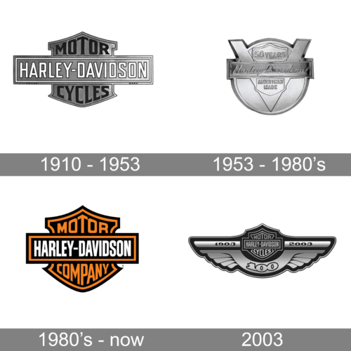
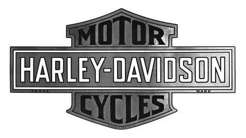
The first Harley-Davidson logo was introduced in 7 years after the company’s foundation. And that is when the iconic “Bar & Shield” design was first created.
The Harley-Davidson logo was composed of a shield-shaped background with a horizontally located on its bar with the wordmark. The Harley-Davidson lettering was written in all caps white traditional front, while the motorcycles nameplate, placed on a shield, used black color.
The logo was slightly changed throughout the years. In 1930 the o lot lettering on the logo was the brand name in a red and yellow palette. It was switched to black and orange in 1933. In the 1949s the emblem was full metal, which looked very brutal and masculine.
1953 – 1965
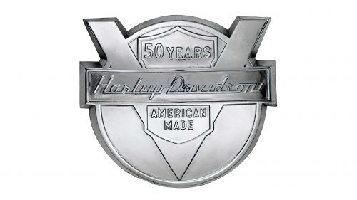
The first major redesign of the Harley-Davidson logo was held in 1953, the 50th anniversary of the brand. The logo of that period was composed of a circle with an enraged V-shaped symbol, which was a celebration of the company’s engine.
The bar, containing the wordmark was placed horizontally on the “V”. The lettering was executed in a custom cursive typeface with strong lines and a flat base.
The “50 years” inscription was placed on the upper part of the Harley-Davidson shield, while the “American Made” — on the bottom one.
The company created a strong and stylish metal medallion with this logo, which looked powerful when placed on the motorbikes.
1965 — 2003
The brand comes back to the original logo version, modernizing it and switching the color palette to monochrome. The shape of the Bar & Shield emblem was refined, and I looked powerful and masculine in the black and white combination.
The most iconic logo, that started a new era of the brand’s history, is still in use today.
What is the story behind the Willie G skull?
The Willie G skull, often associated with the Harley-Davidson brand, is more than just an emblem; it’s a symbol of rebellion and the embodiment of the motorcycle culture’s rugged spirit. Created by Willie G. Davidson, the grandson of company co-founder Arthur Davidson, this design has become one of the most recognizable symbols of Harley-Davidson. It represents a blend of the company’s rich heritage and the personal riding habits of its enthusiasts. Often featured on dealer-added accessories and apparel, the Willie G skull signifies the extraordinary care and passion that riders invest in their bikes, from the choice of color theory in paint schemes like billiard blue to the meticulous selection of creative goods that resonate with their personal identity.
1983 The H.O.G. Logo
In 1983 The H.O.G. was created. The name is an abbreviation for Harley-Davidson Owners Group, which has wide geography. The logo of H.O.G. Is based on its own symbol, which is pretty different from the main brand’s emblem.
The H.O.G. logo is very ornate and is composed of an emblem with a HOG monogram and a wordmark.
The H.O.G. Emblem features an Eagle, sitting on the wheel, which is a stylized letter “O” from “HOG” inscription. The bottom part of the emblem consists of a yellow ribbon with “Harley Owners Group” written in a sans-serif white lettering with a black shadow.
It is a colorful and very detailed logo, which is a perfect accompaniment for the strict and strong Bar & Shield.
The yellow color is a reflection of energy, movement, and optimism. It shows unity and looks remarkable and memorable on the H.O.G. emblem.
2003 Anniversary logo
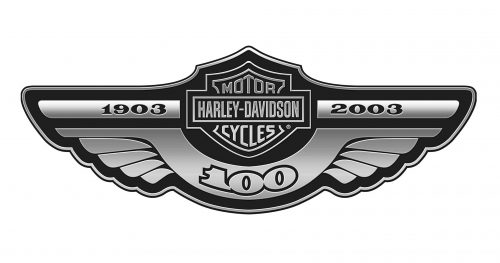
To celebrate the Harley-Davidson 100-years anniversary, the brand design a new logo in 2003. The iconic Bar & Shield remains the main element of the logo, but now it is enclosed into a half of a circular frame with two wide wings.
“1903” is written in the left-wing, and “2003” — on the right. The “100” inscription is arched and placed under the shield emblem.
The winged logo is a reflection of freedom and speed, the brand’s power and influence. It is a strong and outstanding work, which represents the Harley-Davidson history and heritage.
2008 Anniversary logo
The brand was very happy with how the previous logo worked and decided to create a new one in 2008, to mark the 105 years of Harley-Davidson.
All the elements from the 2003 logo remained but were modified. The Bar and Shield emblem are still in the center of the composition, but now it is enclosed in a circle and two wings are curved upwards.
The “105 years” lettering is placed above the Harley-Davidson iconic emblem, forming a kind of crown. The dates “1903 — 2008” are placed on the bottom part of the frame and use a star to separate the numbers.
What does the Eagle represent in Harley-Davidson?
In the Harley-Davidson universe, the Eagle design is not just a motif but a powerful symbol of freedom, high-flying liberty, and the pursuit of the open road. It’s a testament to the brand’s American heritage, mirroring the values of the United States Army, Air Force, Navy, and Coast Guard. This majestic bird, often seen soaring on the brand’s merchandise, encapsulates the spirit of adventure and the boundless freedom promised by the open road. The Eagle represents Harley-Davidson’s commitment to producing motorcycles that are not just means of transportation but vessels of liberation, enabling riders to explore the grand American touring experience with pride and valor.
Today
The legendary Bar and Shield Emblem is in use today and features refined and more confident shapes and lines. The brand uses a monochrome color palette with a bright orange for framing and “Motorcycles” lettering, placed above and beyond the white wordmark.
The Harley-Davidson logo is one of the most recognizable in the world. It is based on clear and strong lines and only three colors, but it looks like a powerful and brutal image for the influential and respected company.
2025 Concept
In 2020 the brand performed a concept of the new visual identity, which will probably be launched by 2025. It is based on a traditional Bar and Shield Emblem, which is more minimalistic and clean.
The brand also created a wordmark-based logo, which will be used on the fashion and accessories lines of the company’s retail products. The iconic black-white-orange color palette remains, but the typeface is simplified.
It is an interesting experiment for the company, which will look stylish and modern on the Harley-Davidson clothing and shoe collections.
What does the Harley symbol mean?
The Harley-Davidson symbol, comprising the iconic ‘shield and bar’ logo with its classic harley-davidson logo design, stands as a beacon of freedom, adventure, and individuality. It’s a historic emblem that has seen the brand through the evolution of the Harley-Davidson logo, from its first motorbike adorned with the company’s first official logo to the current Harley-Davidson logo that captures the essence of the brand’s legacy with bold-black color combinations and v-twin engines. This symbol is not just a marker of quality and power; it’s a representation of the Harley-Davidson Motor Company’s journey through different shapes and eras, reflecting the company name’s resilience and the motorcycles’ symbolism of freedom. It adorns motorcycles, apparel, and accessories, carrying the legacy of founders like Walter Davidson and Arthur Davidson, and fuels the passion and courage of riders around the globe.


