

![]() Beloit Sky Carp Logo PNG
Beloit Sky Carp Logo PNG
The “ferocious” creature seen on the logo of the Beloit Snappers is a snapping turtle, also known as a “snapper.”
Meaning and history
![]()
1982 – 1994
![]()
The team played its first official game in 1982. Affiliated with the Oakland Athletics, the Snappers play in the Midwest League on the Class A level. The logo itself consisted of a blue map of the Wisconsin state with a golden fringe. They put a star onto the city’s location, giving it the same coloring. A white circle was placed in the middle of the map. There were the words ‘Beloit Brewers’ in blue, placed around a baseball glove of the same color, which was located in the center.
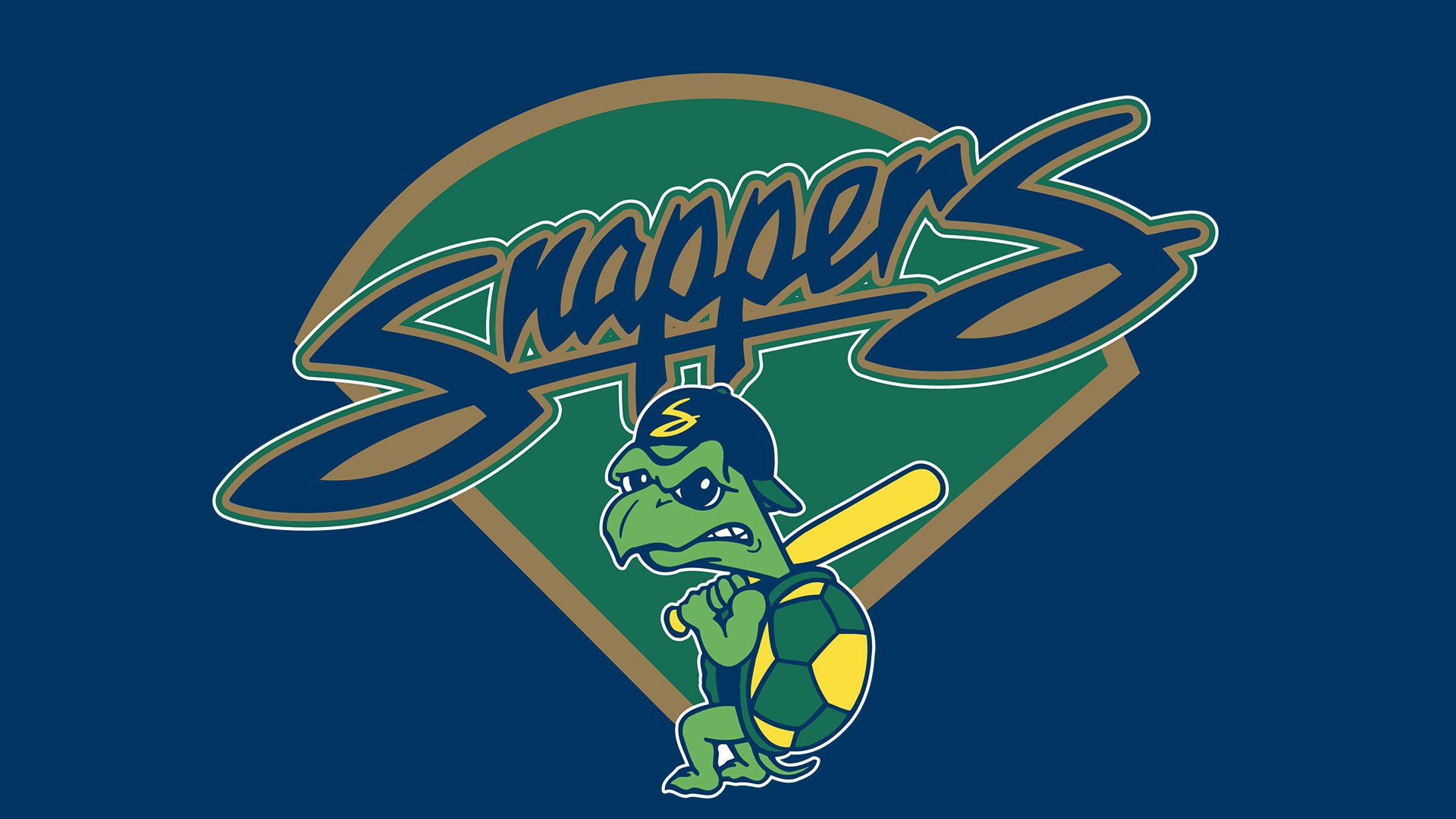
1995 – 2021
![]()
The 1995 logo had fan shape in its background. The core was green, but there were two fringed of brown and blue. It essentially depicted baseball field. Its top is blocked by the writing ‘Snappers’ in big blue letters. They are cursive and seem hand-written. Also, there is a brown outline around these, with thinner layers of white and green further on it. At the base, they drew their mascot – an upright turtle with a big, yellow bat, a blue cap with a yellow ‘S’ on it and a shell with green and yellow tiles in it.
2022 – Today
![]()
They became Beloit Sky Carp in 2022. The emblem changed to a flying goose. It’s mostly grey and black with a red scarf around its long neck. They also added a wrench, carried in the bird’s legs. A slight black fringe is all the way around the bird, followed by a thicker turquoise layer. Beneath it, the words ‘Sky Carp’ are written a black cursive, slightly diagonally. They also have a slight turquoise tint around them. Furthermore, the tops of both capital letters are styled like the heads of geese, vaguely.
Primary symbol
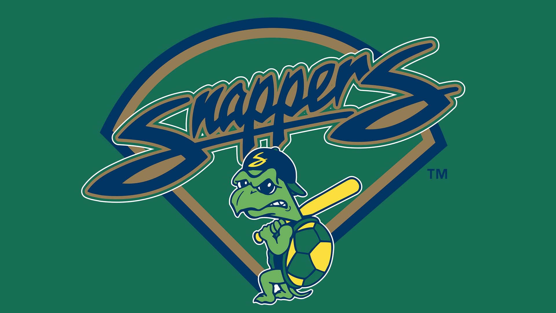
The Beloit Snappers logo (2003) features an anthropomorphized snapping turtle holding a baseball bat in its upper paws. The word “Snappers” in a script imitating handwriting can be seen above. The design is placed over a green circular sector with gold and dark blue outlines.
Cap emblem
The same turtle can be seen on the players’ caps. However, here, there’s no “Snappers” script. Instead, there’s a large gold “S.” Other versions of the team’s cap insignia feature only the turtle’s head on grey or dark blue background.
Colors
![]()
Green and yellow echo the palette of the Snappers’ parent team, the Oakland Athletics. The shades are different, though.


