Ashok Leyland is an automobile company headquartered in Chennai, India. It claims to be among the world’s top ten commercial vehicle makers. The company belongs to the Hinduja Group.
Meaning and history
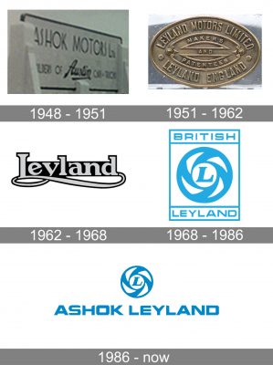
The company was established in 1948 by Raghunandan Saran, a freedom fighter from Punjab, India, in collaboration with Austin Motor Company, England. The brand’s original name was Ashok Motors.
1948
The photos from the company’s archives have preserved the wordmark written above the entrance in the company’s manufacturing facility or headquarters. Here, the words “Ashok Motors” featured a rather light all-caps type with wide “o’s” based on a circle.
1951
In 1951, the company reached an agreement to collaborate with Leyland, UK.
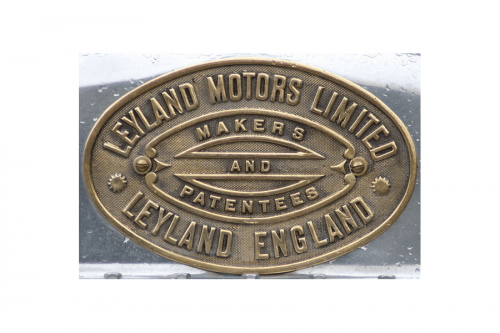
The earliest Leyland Motors logo was an oval with the name of the brand going along its border. In the middle, there was the tagline “Makers and Patenters.”
1962
The logo went through a complete overhaul. The new wordmark showcased the word “Leyland” in an elegant type with unusual serifs. The ends of the serifs had a rectangular shape, while the “path” between the end of the letter and the serif was smooth and rounded.
Another distinctive element of the wordmark was the extended end of the “y.” It formed a loop and stretched below all the letters of the company’s name.
1968
Following the mergers between British Motors and Leyland Motors, a new emblem is introduced.
It already looks pretty close to the current one. In the center, there is a stylized spinning wheel housing the letter “L.”
The wheel is placed inside a square with a thin blue border. At the top, there is a rectangle housing the word “British,” while the word “Leyland” can be seen inside a similar rectangle below. The overall shape of all three elements is a rectangle.
The type used for the name of the company is a minimalist sans serif one. The letters are rather wide and light. The rectangular shape of the letters perfectly fits the overall shape of the emblem. The “A” has a slightly unusual style due to its cut top. Other than this, the font is quite generic. It provides excellent legibility.
The “L” in the center of the wheel, though, belongs to a different type. It has pronounced serifs and is italicized. The fact it’s italicized creates an illusion of motion, which supports the motion implied by the spinning wheel.
1986
The current Ashok Leyland logo is dominated by the same spinning wheel housing the capital “L.” The name of the company can be seen below. It’s given in a single line.
The typeface appears pretty much the same. Yet, if you take a closer look, you’ll notice it has been customized (note, for instance, the streamlined shape of the “L” and the rounded top left angle of the “E”). Also, the wordmark is slightly bolder, which offers better legibility.


