Aquafina is an American brand of still water, manufactured by PepsiCo since 1994. The brand is also known for the production of skin care cosmetics. Aquafina product is distributed across the globe.
Meaning and history

Aquafina is the PepsiCo brand, which has bottled water as its main product. The brand was established in Kansas in the middle of the 1990s, and for the first years has been only known in North America. Today Aquafina is known all over the globe, not only for its natural water but also for a small skincare line, which includes several facial and lip creams.
What is Aquafina?
Aquafina is the name of a natural water brand, established in the United States in 1994, and owned by the PepsiCo Group. The company is known all over the globe, distributing its mineral water through supermarkets on all continents.
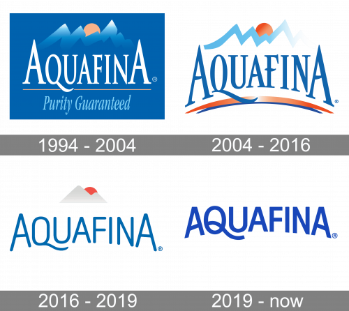
1994 – 2004
The Aquafina visual identity was always based on a wordmark and a mountain image on its top. The snow mountain peaks are the reflection of purity and nature. The previous logo, designed in 2004, was composed of all capitals letters nameplate executed in a serif typeface with first and last “A” enlarged.
The double orange and blue swoosh were underlining the wordmark and balancing the light blue mountain range silhouette with an orange sun.
2004 – 2016

The redesign of 2004 switched the intense blue background of the Aquafina logo to white, making the whole composition more airy and fresh. The logotype was now arched and had a double gradient underline, with thick orange and thin blue arches. The lines of the mountain peaks were refined and boasted a gradient sky-blue tone, which perfectly contrasted with a bright orange sun on top of the emblem.
2016 – 2019
The new Aquafina logo, designed in 2016, looks more stylish and contemporary. The typeface was completely changed. Now it is a fine rounded sans-serif with an elongated and curved tail of the letter “Q”. While the two “A” is still enlarged, the wordmark looks harmonized and elegant.
The mountain emblem was also redrawn and now it is composed of a more modern and smooth image in a white and silver color palette with the red sun beyond it.
The new Aquafina logo is strong and confident, executed in a traditional color palette it looks modern and eye-catching, evoking the brand’s value of purity and quality.
2019 – Today

In many ways, the logo was kept as before. This logo is basically the same wordmark as before, but with bolder letters, blue and slightly different font-wise. These letters aren’t as soft. There was also nothing else besides the wordmark now.
Font and Color
The minimalist yet bright Aquafina logo has a wordmark as its main element, and the typeface of the wordmark is what sets the mood for the whole image. The blue inscription in all capitals has its letters in different sizes, but balanced and neat. The rounded sans-serif font of the lettering is very close to such traditional fonts as Moldr Regular and Ciudadela Rounded, but with the letter “Q” modified. Its elongated and curved tail, underlining the “U” is what makes the Aquafina logo recognizable and memorable.
The cold-blue color of the wordmark is complemented by silver and red of the emblem and white background. This color combination evokes a sense of freshness and hydration, but at the same time works as a representation of the brand’s values and purpose. Blue stands for quality, reliability, and professionalism, while red is the color of strength and passion, and white adds a feeling of loyalty and trustworthiness.


