

![]() Yahoo Logo PNG
Yahoo Logo PNG
Yahoo is one of the pioneering wed-portals and online search-engines, which was created in 1994. Yahoo stands for “Yet Another Hierarchical Officious Oracle.”
Meaning and history
![]()
Yahoo is a brand, that is always in motion, it researches, creates, predicts. And its visual identity is moving with the brand, showing the latest trends and achievements.
The Yahoo logo was always composed of a wordmark, and only once it was accompanied by an emblem, but that experiment didn’t last long.
1994 — 1995
![]()
The first Yahoo logo was designed in 1994 and stayed with the brand for only one year. It featured a wordmark in a black classic serif font. Nothing else. Simplicity and modesty.
1995
![]()
For a year only, the company used a playful logo, where the letters appeared to be jumping. While the “jumping” typeface and the brownish-yellow palette haven’t been used anymore, you can see that the following logos were inspired by the casual style of this one. It is easy to notice this in the way the letters have been often positioned above the line as if to show upward motion.
1995 — 1996
![]()
The Yahoo logo from 1995 is the only one with the emblem. The colorful emblem is composed of a light blue circle and a yellow stylized letter “Y”, resembling a person’s silhouette with his hands up.
The wordmark is executed in purple color and custom typeface with the exclamation sign. Since 1995, the Yahoo exclamation has become the most recognizable part of its visual identity.
1996 — 2009
![]()
The new funny typeface of the wordmark is complimented by a burgundy-red color with a yellow outline on the letters. It is funny, friendly and playful. The exclamation stands out due to the darker shade of the burgundy. This logo was in use for less than a year.
In the same year, the brand creates a new logo — iconic Yahoo typeface with jumping letters and straight confident lines. The wordmark is colored red and represents passion and energy.
2009 — 2013
![]()
The iconic Yahoo wordmark has changed its color to purple. It looks more artsy and creative now, evoking a sense of harmony and movement. The exclamation sign is used as an icon, executed in white and placed on a solid purple circle.
2013 — 2019
![]()
The significant redesign of the Yahoo logo was held in 2013. The letters now feature finer and more delicate lines, which are also three-dimensional. It looks more professional and evokes a sense of expertise and authority.
The color palette remains the same, but purple is gradient now, in order to create the volume.
2019 — Today
![]()
The latest Yahoo logo redesign was made by the Pentagram agency in 2019. The wordmark features lowercase lettering in a bolder and thicker typeface.
The purple color is still there, but in a brighter, more stylish tone. The iconic exclamation sign is italicized, which adds playfulness to the logo.
The Yahoo visual identity is fresh and crispy, it shows the brand as progressive and young, the one that values movement and progress.
Shape
The current Yahoo logo design has been around since September 2013. Today’s logo boasts a fresh design, which reflects the company’s clear business strategy and attitude.
Symbol in Japan
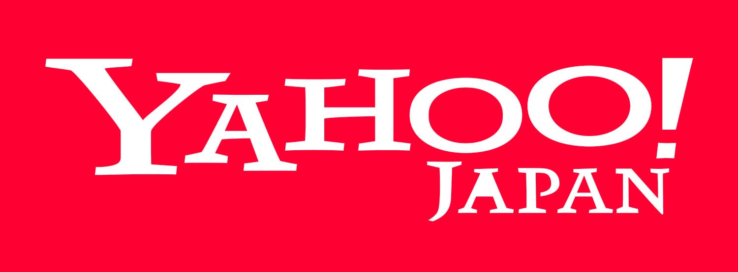
Unlike the international Yahoo home page, Yahoo Japan’s home page was not changed in 2009 or 2013. According to Masaki Hanyuu, the Yahoo Japan representative, the company decided to stick with red as in Japan this color is considered the symbol of power and activeness, while purple does not have such connotations. Moreover, Yahoo Japan partly belongs to Tokyo telecommunications giant SoftBank Group, so it had the right to keep its independence.
Finance logo
![]()
Having a look at the Yahoo Finance home page, you immediately see that it is a part of the Yahoo’s network. The word “Yahoo” is given in exactly the same font and color as in the parent project. The only difference is the word “Finance” placed right under the regular logotype. Unlike the purple basic logo, the word “Finance” is light grey.
News logo
![]()
The Yahoo News logo was developed on the basis of the same principles as other services of the Yahoo’s network. The main and most eye-catching part of the wordmark is “Yahoo” in purple, while the word “News” in grey capital letters is placed below it. The purple color, in itself, is rather discreet, so the choice of color for the “News” seems natural, as grey does not steal the limelight.
Mail logo
![]()
The Yahoo Mail home page is totally minimalistic. Unlike the pages of other services of the network (like Yahoo News or Finance, for instance), it does not contain much more than the usual parts of any login page. The color palette is also very simple and includes the purple for the Yahoo Mail logo, blue and black for other letterings, and white for the background.
Sports logo
![]()
The first word on the Yahoo Sports logo is given in the same typeface as in other home pages of the network, yet the color is different. While in the Mail and News homepages, for instance, the word “Yahoo” is given in purple, the Sports home page features the white wordmark on the black background. The word “Sports” is also white. However, the top panel is still purple, like on other Yahoo’s products.
Icon
The Yahoo Icon is cool and modern. Even though there are only two colors used for it and only two simple elements placed on the background, it still looks intense, energetic, and super actual.
The icon of Yahoo is composed of a solid purple circle as a background, a white uppercase “Y” in a custom serif typeface with thick straight lines and different heights of the bars, and a fancy exclamation sign, which is shorter yet thicker than the lines of the letter. The sign is also executed in white and makes a perfect accompaniment to the jumpy “Y” letter.
Color
![]()
The yahoo logo sports a bright shade of purple. It appears as a purple wordmark with an exclamation mark on a white background or vice versa.
Font
![]()
The Yahoo logo has used serif font for the most part. Today, it uses what many experts and users call an individual ‘Yahoo font’, which is actually a slightly modified san serif font.
Did Yahoo change their logo?
Throughout its long history, this search engine and email service provider has changed its logo several times, with the latest redesign being held in 2019. This is when the colony decided to start writing its name in the lowercase, trying to be more friendly and closer to its audience.
What is the logo for Yahoo?
The Yahoo logo depicts the name of the company, written in the heavy lowercase characters in a modern geometric sans-serif font, and followed by an elongated exclamation mark, slanted to the right. The logo is executed in an intense and deep shade of purple, a color of creativity and imagination.
Is Yahoo still here?
Even though this internet company today is less popular than its competitors, Yahoo still exists and is used by millions of people from all over the globe. The company is one of the global Internet pioneers. Founded in 1994, Yahoo was the one responsible for the first e-mail platform, available for mass audience.
Who made the Yahoo logo?
The latest redesign of the Yahoo visual identity, was held in 2019 by the famous Pentagram agency. As for two previous versions of the badge, they were created by David Shen (1995) and Marissa Mayer (2013).


