

![]() Chrome Logo PNG
Chrome Logo PNG
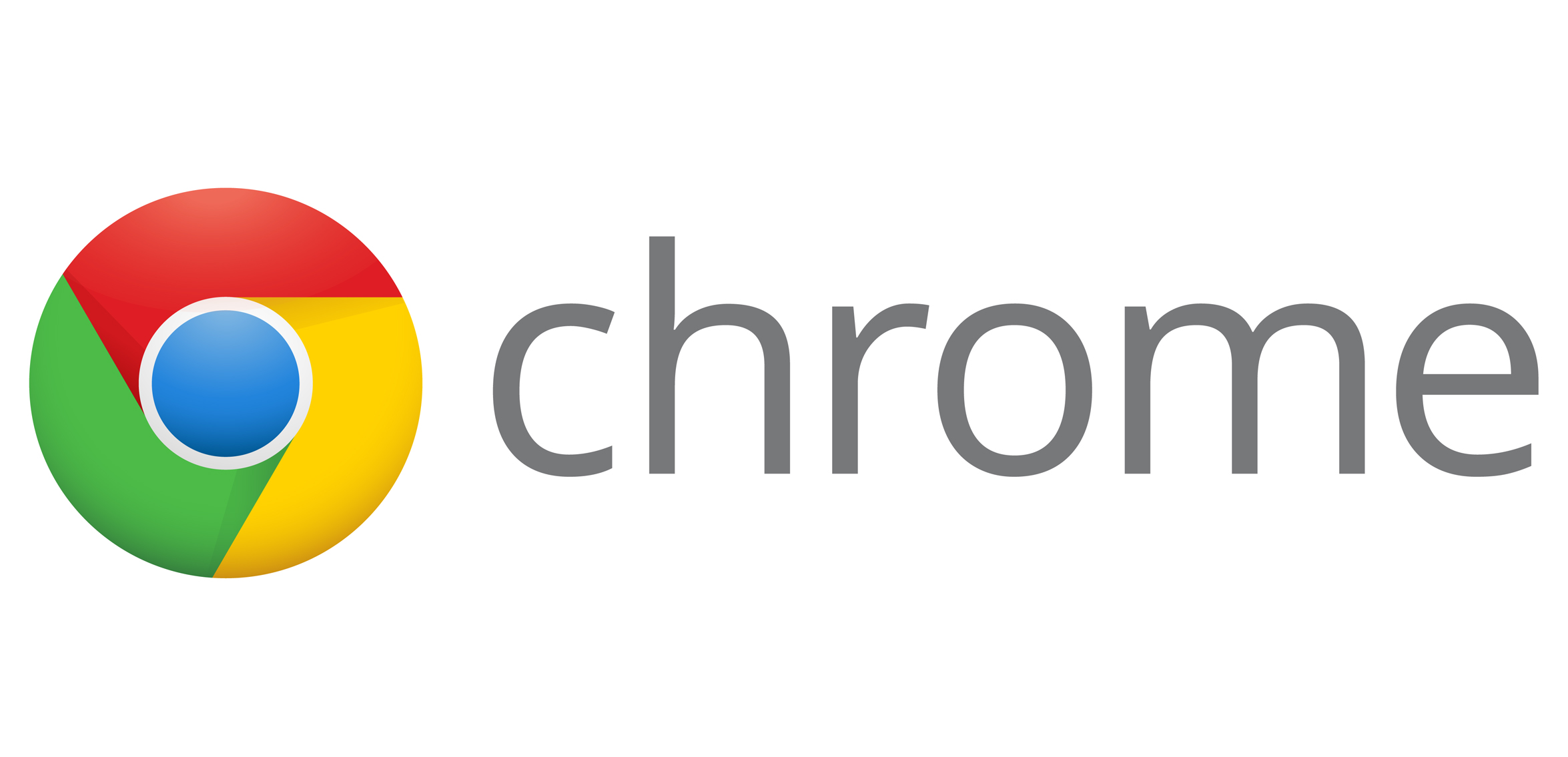
Like each Google product, Chrome has a distinctive logotype emphasizing some of its core properties. In case of the Chrome logo, it is the simplicity of the user’s web experience.
Meaning and history
![]()
Google Chrome browser has been very consistent with its visual identity, and once introduced in 2008, its iconic multicolor swirl symbol became synonymous to the browser and doesn’t need to be changed to any other icon.
2008 — 2011
![]()
The emblem, adopted by the browser in 2008, boasted a three-dimensional rounded figure, composed of three equal segments and a blue sphere in the middle. Each of the segments had its sides cut diagonally, which created a sense of swirling and moving, adding a sense of speed and dynamics. The three segments featured red, yellow, and green color, which in combination with blue made the color palette, reflecting its affiliation with the Google Company and showing the endless possibilities of the browser to its users.
2011 — 2014
![]()
The icon was simplified in 2011, and now the three-dimensional effect and glossy surfaces were gone. The logo became flat, yet still had light shadows, creating a sense of rotation. The blue circle in the middle was executed in gradient shades, and its matte texture resembled a globe.
2014 – 2022
![]()
In 2014 the logo got simplified even more by replacing the gradient blue circle with a plain light blue one. The outline of it was switched from gray to white and became wider. As for the colored segments, their contours and shadows were also slightly refined.
2022 – now
![]()
A very minor change was introduced in 2022 but it made a huge difference. The updated logo was created by Chrome’s new logo designer Elvin Hu. He was able to give the emblem a modern and refreshed look to show that Chrome has changed over the years, while still preserving the characteristics users love it for. The designer decided to remove the grayish shading, which made the colors brighter and cleaner. This also made the logo look flat. In addition, the blue circle in the center was made more saturated to match the bright colors around it and was slightly enlarged.
Original emblem
Starting from the very first version, the Chrome icon has used the colors extracted from each letter of the Google wordmark. So, as far as there are four colors in the Google wordmark, the number of colors in the Chrome’s palette is the same (plus white borders).
Icon
Since 2008 the Google Chrome Icon has been using the same concept and idea — a multicolor rounded, flower-like geometric composition with a solid blue circle in the middle. Though in the beginning the icon was made three-dimensional, and today it is simplified to a minimalist flat symbol.
The main circle of the icon is executed in the corporate Google colors — green, red and yellow. As for the central part of the Chrome “flower”, it is drawn in light blue and outlined in white, which makes it airier and fresher.
The Google Chrome Icon perfectly expresses the speed and simplicity of the modern browser and operating system in general.
Font
![]()
Someone who does not understand the core reasoning behind the development of the Chrome browser may call the typeface too simple and overtly generic. It has a lot in common with such simple fonts as Verdana or Myriad Pro. However, taking into consideration the concept of the product, it is obvious that the typeface is simple for a reason.
Color
![]()
The icon is comprised of the four primary colors, if you do not take into consideration the white borders inside the circle.


