The Unilever logo features a big blue “U”, the company’s initial. The letter comprises several icons each having its unique connection with the business.
Meaning and history
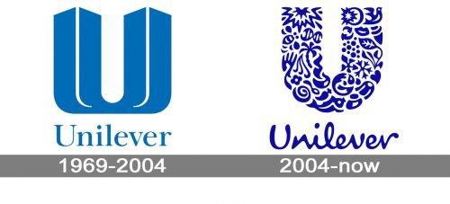
Though the history of Unilever starts in 1929, its first logo was created only in 1967 and got redesigned just once, in 2004. This is a truly impressive consistency for such a large company, which tells a lot about its stability, fundamental approach, and quality-centrism.
1967 – 2004
The very first Unilever logo, created in 1967, featured a pleasant and delightful blue and white color palette, which looked fresh, bright, and very friendly. It was a combination of a bold and eye-catching emblem, and a delicate traditional logotype, placed under it. The emblem depicted a stylized letter “U”, which has the edged of its vertical lines triangular, looking like arrows. The vertical bars of the “U” resembled two towers and looked powerful and elegant.
As for the logotype, it was written in the title case of a sleek and slightly extended serif typeface, which added stability and confidence to the image.
2004 – Today
The redesign of the Unilever identity was held by Wolff Olins in 2004. The only thing that remained untouched was the structure — an enlarged “U” above the wordmark, though all other elements were redrawn. First of all, the color palette was elevated and the blue now gained a darker and brighter shade. Secondly, the “U” gained rounded contours and its body was formed by 25 small images, symbolizing all the directions the company works in. And, finally, the logotype. It was completely changed and now is executed in a handwritten cursive with smooth rounded lines, looking modern, yet friendly.
Brands under Unilever
There are many internationally recognized brands, owned by Unilever. The majority are either products of personal hygiene or food. Some of the more prominent include Lipton, Dove and Axe.
Lipton is a British brand of beverages, mostly known for their tea. It was started in the UK in 1890, and is now in co-ownership between Pepsi and Unilever. Lipton’s logo depicts a yellow sun-like circle with a red nameplate inside. In its middle, there was the word ‘Lipton’, written in white letters with small serifs.
Dove is an American brand of hygiene products, which largely includes body washes, soap, antiperspirants and other. The brand was started in 1957 and later became property of Unilever. Their logo depicts the word ‘Dove’, written in blue cursive letters with a golden imprint of a dove bird beneath.
Axe, also known as Lynx, is a brand of male hygiene products, mostly known for their deodorants. Axe was launched in 1983 by Unilever, and it remained in their ownership ever since. The logo is the word ‘Axe’, written in all capitalized letters in white, angular letters with black frames. The word ‘Lynx’ is sometimes written below in the same style to denote the brand in its entirety.
Symbol meaning
 One more Unilever symbol is a bee, which symbolizes creative work, pollination, as well as environmental challenges. The double helix emblem is used a genetic blueprint of life, as well as the life’s smallest ingredient and a symbol of health.


