The story of the AXE brand started in France in 1983. It was introduced in Europe and Latin America before being launched in the US in 2002. The brand of male grooming products is aimed at the younger target audience.
The original range included body sprays. In 2004, antiperspirant and deodorant sticks were added.
Meaning and history
Currently Axe is represented in more than 60 countries. The brand was first launched in France in 1983 and has been gaining popularity every year. The key product of the brand is bodyspray deodorant, which combines ultra-fashionable fragrances and protection against sweat odor.
Axe’s success is built on the use of innovative ways to promote the product. This applies to advertising as well as to constantly upgraded packaging. Regularly renewed fragrances, along with promotional support, attract new fans of the brand.
One of the most recent commercials “Getting dressed” won the Golden Lion at the Cannes advertising festival for the quality of advertising that meets international standards.
What is Axe?
Axe is a leader in sales of perfumes and hygienic cosmetic products for men. It is known in the USA, Great Britain, EU countries and Latin America. The brand’s key product is a men’s perfume deodorant that exudes a luxurious fragrance that makes “angels fall from the sky,” according to the advertisement.
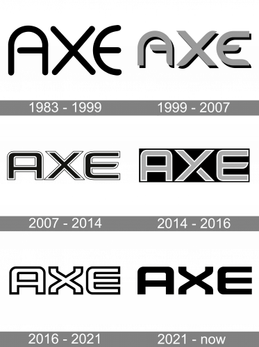
1983 – 1999
The original Axe logo hardly bore anything in common with the current one, except for the name of the brand. The design combined semi-circles (the top of the “A” and the “E”) with the angular elements and straight bars (the “X,” the middle bars of the “A” and “E”). The middle bar of the “A” looked unusual: it was shorter than usual and was separated from the left vertical bar by a white gap.
1999 – 2007
The basic shape of the glyphs remained the same, and yet, there were a couple of alterations providing a fresh look. The black letters became gray and adopted shades. They grew bolder. The rounded ends were replaced by regular ones. The middle bar of the “E” was shortened.
2007 – 2014
The semi-circles on the top of the “A” and the “E” were replaced by slightly rounded rectangles. The letters were now black with two outlines: a white one and a black one. The middle bar of the “E” grew almost as long as the top and the bottom one. It still had a unique asymmetric end.
While the logo described above could be used on its own, there was also a version with the tagline “The Axe Effect.” The tagline featured a generic sans. All the letters were capitalized.
2016 – 2021

While the alterations have been comparatively subtle, the design looks pretty different. The letters are now white with thick black trim. The shape of the “A” has remained the same. The “X” has adopted distinctive turns on the ends. The middle bar of the “E” has grown longer – now it is of the same length as the other two bars.
2021 – Today
The 2021 redesign isn’t much different from its predecessor. They basically got rid of the black fringe and turned the white bits black. As a result, you get largely the same wordmark, but thinner and fully dark. They redrew some portions of these letters, but the changes are minimal.
Lynx emblem
In the United Kingdom, Ireland, Australia, New Zealand, and China, the product is sold under the name Lynx. The wordmark seen on the bottles looks pretty similar to the Axe logo in terms of the overall style. The “X,” which can be seen in both the versions of the name, looks exactly the same. The other glyphs in the wordmark also copy the style of the Axe insignia. For instance, the ends of the “Y” feature the same turn as the “X.” The connection between the two bars of the “L” in the Lynx logo looks the same as the rounded angles of the “A” in the Axe wordmark. Also, all the letters are white with black trim.
Font and Color
The the stylish uppercase lettering from the primary logo of Axe is set in a designer sans-serif typeface with interesting futuristic contours of the characters. The closest fonts to the one, used in this insignia, are, probably, Armchair Modern OT CGauge, or Sporty Pro Light, with some modifications of the characters’ contours.
As for the color palette of the Axe visual identity, it is set in plain black, which is a masculine and stable shade, representing strength, quality and professionalism of the brand and its products.


