

![]() UNICEF Logo PNG
UNICEF Logo PNG
The UNICEF logo may seem absolutely transparent and self-explanatory, and yet there are a couple of interesting details that are often misinterpreted.
Meaning and history
![]()
The United Nations Children’s Fund appeared in 1946 with the mission of protecting European children who suffered from the devastation of World War II. However, in the course of time the mission have become broader and started to include assistance to children and mothers in developing countries.
1946 – 1953
![]()
The very first UNICEF logo featured an elegant yet strict badge, composed of a circular image, depicting the earth, enclosed into a wreath frame. While the inner part of the monochrome emblem was executed in thin fine lines, the framing featured bold elements and thick touches.
1953 – 1960
![]()
The redesign of 1953 introduced a new version of the UNICEF logo. The two elements from the previous badge were kept but redrawn in thinner black lines, and the bold black silhouette of a child was placed in the middle of the composition. There was also a two-leveled “For All the World’s Children” inscription arched above the upper part of the badge. The lettering in the uppercase was executed in a simple medium-weight sans-serif font. The “UNICEF” logotype was arched under the badge, in thick lines and with lots of space between the capital letters.
1960 – 1975
![]()
In 1960 the logo was redesigned against the lettering from the top part of the logo was removed, and the bottom line “United” inscription switched its typeface to a bolder and more modern sans-serif, with rounded elements and straight cuts of the letter lines. As for the graphical part, the lines were modified and the black kid’s silhouette was replaced by the black image of a woman holding a baby in his hands. This was a graphical representation of love, support, and care.
1975 – 1978
![]()
In 1975 the UNICEF logo changed its concept and made the wordmark the main part of the identity. The stylized sans-serif inscription executed in extra-thick lines was set in black on a white background and had the dot above the letter “I” replaced with the iconic globe emblem with the mother and the child. It was a contemporary and bold logo, which evoked a sense of protection and stability.
1978 – 1986
![]()
The redesign of 1978 added lightness to the logo by complementing each black letter of the inscription with a thin white line coming through the middle and repeating the shape of each symbol. Though overall the logo remained untouched, keeping the monochrome color palette, the emblem, and the shapes of the letters as they were on the version of 1975.
1986 – 2001
![]()
In 1986 the UNICEF logo was redesigned again. Now the emblem was set on the right from the logotype, which was set in the lowercase of a simple and strict sans-serif typeface, using medium-weight lines. The clean contours of the letters and pretty much space in the inscription made the whole composition look stable yet airy and friendly.
2001 – Today
![]()
The UNICEF logo comprises the image of a mother and child, a globe, olive branches, as well as the wordmark.
The depiction of a mother and child emphasizes the noble mission UNICEF undertakes, while the olive wreath can be interpreted in a number of ways. In Ancient Greece, it was the prize for the winner at the Olympic Games, so it can be a symbol of victory. Also, the two olive branches can be explained as a reference to the Word of God from the Bible. As part of the UNICEF emblem, the olive branches are most often understood as the symbol of peace.
The globe emblem
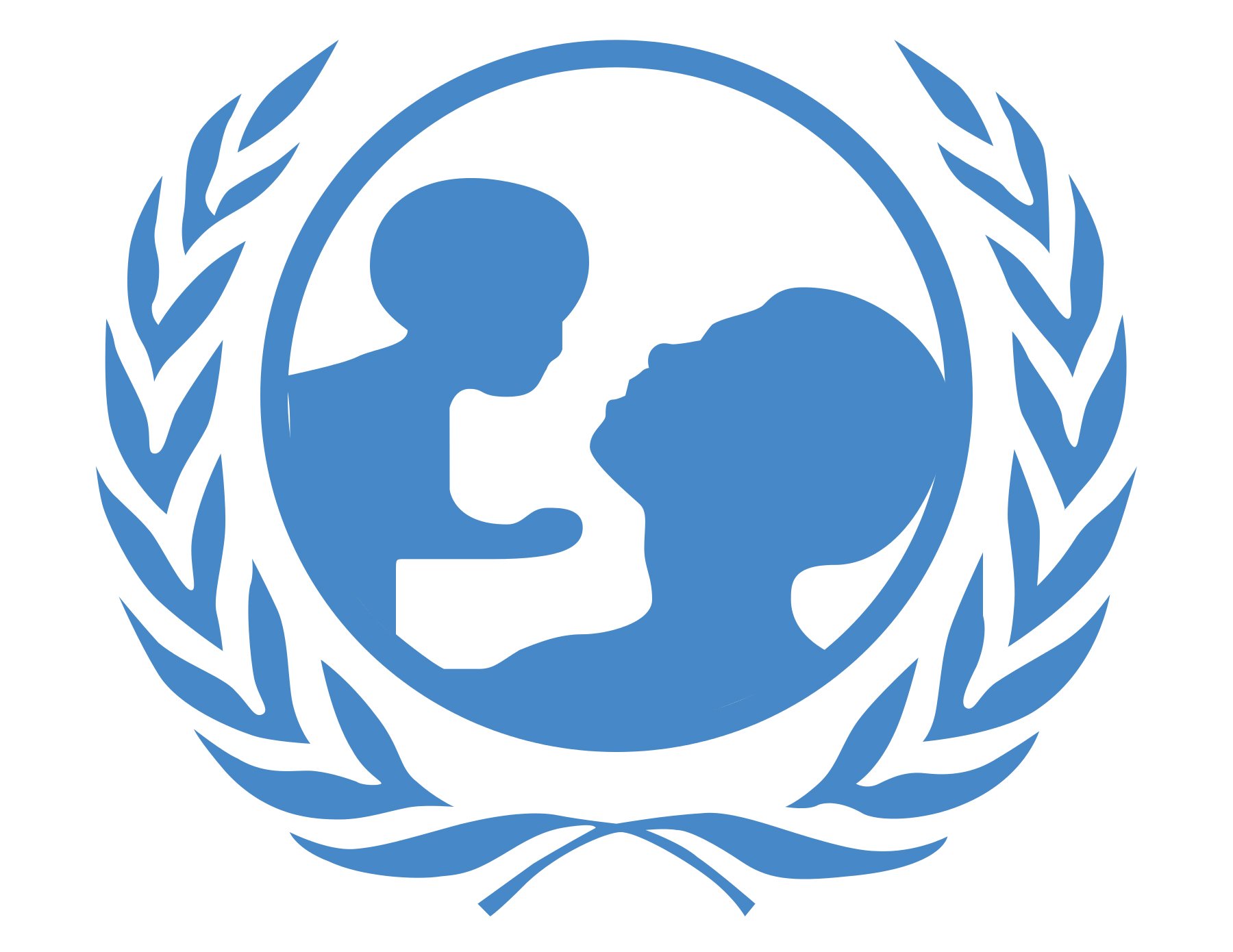
The depiction of the Earth is a way to emphasize that UNICEF takes care about children all around the world and that borders do not exist for this organization. Interestingly enough, if you take a closer look at the grid-like globe as it appears in the UN logo, you may notice that the grid divides the globe into 33 parts. Some conspiracy theories connect this fact with the 33 steps of the ladder that a Freemason may climb, thus creating a link between UNICEF and Freemasonry.
Font
![]()
The name of the organization, which should have been given in capital letters, is lowercased. The simple sans-serif typeface looks very much like the Univers Light font created by Adrian Frutiger in 1954. It is a clean, transparent type.
Color
![]()
One of the features of the UNICEF logo that is often misinterpreted is its color scheme. The light, optimistic shade of blue in combination with white are often understood as the symbol of the sky and the clouds. However, the reason for choosing blue and white was the fact that they are the official colors of the United Nations.


