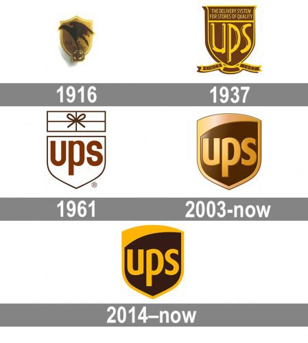
Whatever modifications the UPS logo has gone through, it has been consistent in terms of the overall shape. The brownish color palette was present almost always, with the exception of the period from 1961 to 2003.
Meaning and history
UPS, which today is the world’s largest courier company, began in 1907, when 18-year-old Claude Ryan and 19-year-old Jim Casey founded the American Messenger Company in Seattle, Washington.
Already in 1908 year the company merged with its main competitor and purchased its first car, a converted Ford Model T. Then the founders decided to focus on the delivery of packages from groceries and changed its name to Merchants Parcel Delivery. The business grew quickly, and with high-quality service and careful handling of each shipment, MPD gained an excellent reputation among city store owners.
In 1916, Charles Soderstrom joined the company, and it was he who suggested that the company’s vehicles be repainted a dark brown color that was less noticeable for dirt. In the same years, the company adopted its present name, United Parcel Service.
Today UPS is the world’s largest express delivery company, with almost 500 billion in revenue and a leader in supply chain management.
What is UPS?
UPS is an American company providing postal, courier, and other logistics services around the world. UPS is a global delivery service, the top transcontinental logistics system. the company was established in 1907, and today its services are available all over the globe.
1916 – 1937
In 1916, the United Parcel Service of America adopted its first logotype. It depicted an eagle with a tied package in its talons. The lettering on the package read: “Safe, swift, sure.” On the background, there was a bronze shield shape with a gold outline. The bird itself was dark brown. James E. Casey, the founder of UPS, chose the shield as the official emblem shortly after his company merged with a local rival.
1937 – 1961
It was only in 1937 that the current name of the company, UPS, appeared on the logo. The letters were of a noble gold shade. The shield’s shape was slightly altered, and there was also the lettering: “The delivery system for stores of quality.” In addition to this, there was the text “Since 1907,” referring to the year when the company was established.
1961 – 2003
Looking at the symbol designed in 1961, one cannot help but notice the curious combination of a medieval shield and a fun string-tied package above it. As Paul Rand, who created this logo, put it, “I do not use humor consciously, I just go that way naturally.”
The 1961 logo was notable not only for its sense of humor, but also for an absolutely new color palette. It was the only logo that used neither brown, nor gold. Instead, there was just black and white.
2003 – 2014
 The 2003 redesign has brought back the brownish hues. The shield looks modern without compromise with its minimalistic lines and sleek lettering.
2014 – Today

The redesign of the IPS visual identity, help in 2014, kept the style and shapes of the previous versions but switched the emblem from a three-dimensional and gradient crest to a flat and simple one. Now the main color of the emblem is dark chocolate, which looks calm and cozy contrasting with a dark and intense yellow of the upper line and the “UPS” inscription, written in a stylish sans-serif font, in the lowercase.
Font
Simple lowercased letters look recognizable due to the unusual shape of the “u” character.
Color
Throughout its entire history, UPS has stayed loyal to the color palette chosen almost a hundred years ago. The brownish and gold shades that appeared in the very first version of the UPS logo are still present in the current one.
What does the UPS logo stand for?
The current logo of UPS is pretty simple in its meaning — just the name of the company, depicted in three bold sans-serif letters, written in yellow against a solid dark background of a modernized crest. As for the original version of the badge, it was more meaningful, as had an image of an eagle on it, which stood for speed and motion.
Why did UPS change its logo?
The UPS logo was changed to a more minimalistic one to reflect the growth and progress of the company and to show its willingness to move with the world and to evolve. The new color palette creates a strong contrast, which symbolizes confidence and excellence.
Who created the logo for UPS?
The current concept of the UPS logo was created by Paul Rand, a famous American graphics designer. As for the very first version of the logo, it was designed by James Casey, who adopted an eagle as a perfect mascot for representation of the delivery services, provided by the company.
Can I use the UPS logo on my website?
To use the UPS logo for your business purposes you need to get permission from the company, as the badge is copyrighted. However, UPS allows using its icon for the websites, accompanied by the Authorized Shipping Outlet inscription.


