Accenture (Dublin, Ireland) is a major technology and management service with a staff of more than 250,000 people around the globe. Its network covers more than 120 countries.
Meaning and history
It took three months of intensive work for the management staff to come up with a name for the company. Kim Petersen, a business consultant to Andersen Consulting (the company’s former name), offered the name Accenture to accentuate the firm’s determination to break stereotypes and open new horizons in providing consulting services for clients. Also, it symbolizes the company’s eagerness to help clients change their future for the better. The name was officially accepted in 2001. The logo itself had been drafted a few months earlier.
What is Accenture?
Accenture is the name of a European company, engaged in the professional consulting and informational technology segment. The company was established in Dublin at the end of the 1980s, and by today has grown into one of the largest and most reputable players in the international market.
2001 – 2017
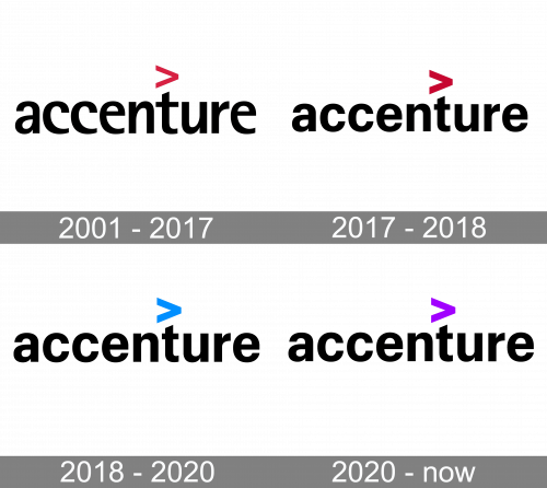
The 2001 logo has a black wordmark as a central piece. The font is an artistic sort of sans-serif with hook-like forms all over it. All the letters were lowercase, and there was also a red ‘>’ symbol above the letter ‘t’.
2017 – 2018
In 2017, the font changed into a more ordinary sans-serif style with the usual forms and proportions. The ‘>’ sign also became a bit bolder.
2018 – 2020

In 2018, they made the sign turquoise, keeping all the rest as it was.
2020 – Today
In 2020, the color changed to purple, and that’s it.
Shape and colors
The logo’s straightforward design fully reflects the message of the name itself. To emphasize the service’s availability, the name starts with a lower-case ‘a’. To stress the company’s vector for promising and dynamic future, the logo developers added a ‘greater-than’ symbol above the ‘t’. The black letters suggest the company’s unflagging striving for excellence.
What does the Accenture logo mean?
The minimalistic Accenture logo is a representation of the company’s professionalism and stability. The lowercase lettering also looks very modern and friendly, showing such sides of the company as accessibility and reliability. As for the bright purple tick above the inscription, it symbolizes movement and growth, with the color standing for wisdom and creativity.
Is Accenture Strategy different from Accenture?
Accenture Strategy is the sun-division of the Accenture Company, which is responsible for business developing strategies and planning. Apart from the Strategy division, there is also Accenture Technology, specialized in the strategies application and use.
What is Accenture Strategy?
Accenture Strategy is one of the branches of the Accenture company, which is specialized in the business strategies developing. The division uses the latest methods in its field to provide its clients with the best solutions for their businesses.
What is the tagline for Accenture?
There are two options of slogans, used by Accenture, depending on the needs and the placement of the logo. The primary one is “Let There be Change”.l, which is used by the company since 2020. Although, pretty often you can still see the old version of the Accenture motto, “Hight Performance. Delivered.”, which brilliantly represents the fundamental approach of the company.


