Motion Picture Association is a non-profit organization, formed by 5 film-makers of the United States in 1922. Today there are six members in the association — Netflix joined cinematography giants in 2019. The association is focused on lobbying, promotion, and protection from piracy.
Meaning and history
The visual identity of the Motion Picture Association has had three major redesigns, but all of its five logo versions boast a very recognizable style and represent the reputable and influential cinematography organization at its best.
1922 – 1957
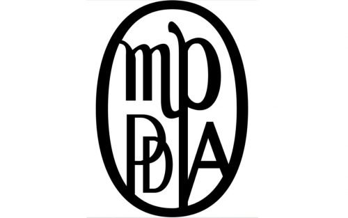
The very first logo was introduced in 1922 when the union was called Motion Picture Producers and Distributors of America, or simply MPPDA. The logo featured a vertically oriented oval with a black elegant monogram inside. The monogram was set in two levels — with “MP” on top, written in cursive lowercase, and the “PDA” it the bottom part, capitalized and executed in a strict geometric sans-serif.
1945 – 1967
The name of the association was changed to Motion Picture Association of America’s, and the logo was redrawn in 1945. It was the same oval medallion, but with a thinner outline, and a different monogram inside. The enlarged lowercase “MP” on top was placed above two capital “A”s in sans-serif, and the elongated tail of “P” separated two letters of the bottom part of the logo.
1967 – Today
The new logo for the association was introduced in 1967, and we all can still see it today. The horizontally oriented oval with black outline and arched lines, resembling meridians, had a solid black circle in the middle. The circle in a double black and white outline had four white smaller circles inside, which represented a film camera.
1967 – 2019
The underlined wordmark was added to the logo a bit later in 1967. The inscription in capital letters was executed in a narrowed bold sans-serif and was underlined by a thick black horizontal line.
2019 – Today
The name of the organization was shortened to Motion Picture Association in 2019 and the new logo was introduced in the same year. It is composed of an emblem with massive lettering under it. The emblem was taken from the 1960s, and today the horizontal oval with a stylized image of a camera is placed above the simple and neat “MPA” wordmark, executed in a traditional geometric sans-serif.
Font and color
The lettering on the MPAA logo is executed in a strong yet simple sans-serif typeface, which is pretty similar to such fonts as 35 – FTR Bold and -OC Format Sans XBd. The typeface looks modern and stylish, even though it has the letters built with laconic straight lines.
The visual identity of the association has always been executed in a monochrome palette, which is timeless and elegant. It reflects the professionalism and expertise of the MPA and shows it as a strong and reputable organization.


