Lynx is a brand of male grooming products that belongs to the British multinational consumer goods giant Unilever. This brand name is used in several countries, including the UK, Ireland, Malta, Australia, New Zealand, and China, while on other markets, the same products are sold under the Axe label or, alternatively, under the EGO brand. The reason for this is the trademark issues with the word “Axe” that Unilever faced in several countries.
Meaning and history
The connection between Lynx and Axe is key for understanding the evolution of the Lynx logo. The two brands have changed their wordmarks simultaneously and based on the same principles. So, even though the wordmarks are formed by different glyphs, their overall style has been almost identical. However, there were still small exceptions to this rule, which you may notice if you compare them side-by-side.
What is Lynx
One of the world’s most popular male grooming products brands, Lynx (Axe) is geared towards the younger male demographic. The main brand, Axe, was introduced in France in 1983 and drew inspiration from the Impulse brand, which also was the property of Unilever.
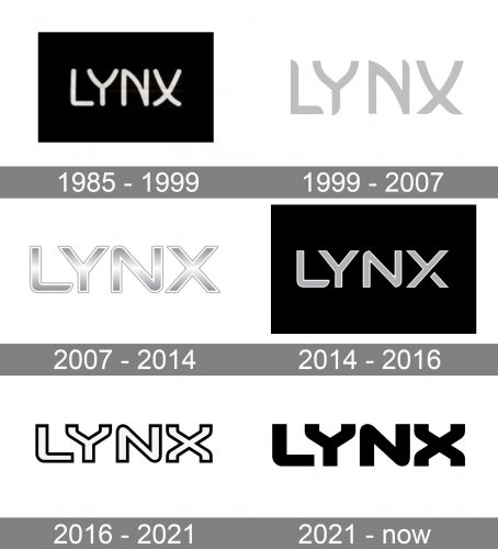
1985 – 1999
Take the original logo, which was used when the Lynx brand was introduced. The glyphs had rounded corners, and even their overall shape was slightly softened and rounded – several elements that are typically straight were replaced by curved lines, for instance, the diagonal line in the “N” or both the lines of the “X.”
This approach just copies the one used in the Axe logo, where both the initial “A” and the final “E” were curved. However, in both the brands’ wordmarks, the curved lines are balanced with straight ones. As a result, the “X,” which is the only glyph used in both the names, looks different in the two logotypes.
1999 – 2007
The ends of some of the glyphs were updated. Compare, for instance, the “L” and the “N” in the Lynx wordmark with the left end of the letter “A” and the lower end of the “A” in “Axe.”
Some depth was added to both the wordmarks, although this effect was achieved in two different ways. The glyph in the Axe wordmark got black shades, while the Lynx wordmark got a slight gradient.
2007 – 2014
A white and black outline was added to both the wordmarks. The shape of the glyphs lost some of the curves. The ends of the letters weren’t rounded anymore. Only a single end in each of the logos reminded us of the unusual half-rounded ends of the glyphs in the previous version (in the case of the Lynx logo, it’s the lower end of the “L”). The turns in the “N” were also rounded.
2014 – 2016
Here, the two wordmarks look especially similar in their style. Both feature light gray letters with a white outline and black background. The “X’s” with a distinctive gap look identical.
2016 – 2021
The shape of the glyphs was tweaked in the same style in both the wordmarks. The “X’s” are still identical in the two wordmarks, although they represent a radical departure from the previous versions.
The glyphs are formed by a contrasting thin outline. In the case of Lynx, the outline is white, while the background and the filling of the letters are black. Axe has a reversed palette.
2021 – present
Now, the filling is of the same color as the outline, which provides enhanced legibility. The shape of the letters has been preserved. The color scheme is reversed in the two logos.
Colors and font
The palette of the Lynx logo has revolved around white, black, grayish, and silvery tones. The brand has gone through several typefaces, each conveying a slightly different image.
What is Lynx
One of the world’s most popular male grooming products brands, Lynx (Axe) is geared towards the younger male demographic. The main brand, Axe, was introduced in France in 1983 and drew inspiration from the Impulse brand, which also was the property of Unilever.


