

![]() Lipton logo PNG
Lipton logo PNG
The Lipton trademark and its sun disc used as a logo are the most famous tea brand in the world. Among all the many competitors under the control of Lipton – more than 10% of the world tea market.
Meaning and history
![]()
Since its early years, the most famous tea brand in the world has been creating its logos in one and the same color palette — yellow and red, a representation of warmth, love, and joy, a combination, evoking smile and a sense of stability. The simple elegance of the Lipton logo made its badge iconic and instantly recognizable.
1890 – 1972
![]()
The very first Lipton logo was introduced in 1890 and featured a red rectangular banner with a yellow sans-serif lettering on it. The wordmark was set in all capitals and executed in a bold and neat font with thick lines and straight geometric edges. The banner was placed on a yellow background, and when on the tea packaging, it was accompanied by a red portrait of the company’s founder, and some additional red text, which was usually a note about the product’s high quality.
1972 – 2002
![]()
In 1972 the modern logo was introduced — a red horizontally stretched badge with its middle part arched to top and bottom. The medallion featured a double outline — thick white was enclosed in a thin red frame. The white lettering on a red background was written in the title case and executed in a simple clean sans-serif typeface, which is outlined in black and with a medium-thick black shadow. Though there were no yellow accents on the logo itself, it has always been placed on a yellow background of the tea packaging.
1992 – 2002
![]()
In 1992, they decided to remove the white space around the red figure. Instead, they added a yellow outline just within its borders. What’s more, they changed the font a softer style with curved lines all over it. The black frame also was replaced with minor dark shading.
2002 – 2014
![]()
The double white and red outline was replaced by a thin black one, and the red background of the badge gained some gradient shades. Now the emblem looked a bit three-dimensional and glossy. The contours of both wordmark and the medallion were refined, its smooth sleek likes and sharp angles created a very balanced image, evoking a sense of professionalism and elegance.
When placed on yellow tea boxes, the logo was underlined by a smooth gold curve, repeating the contours of the emblem’s frame.
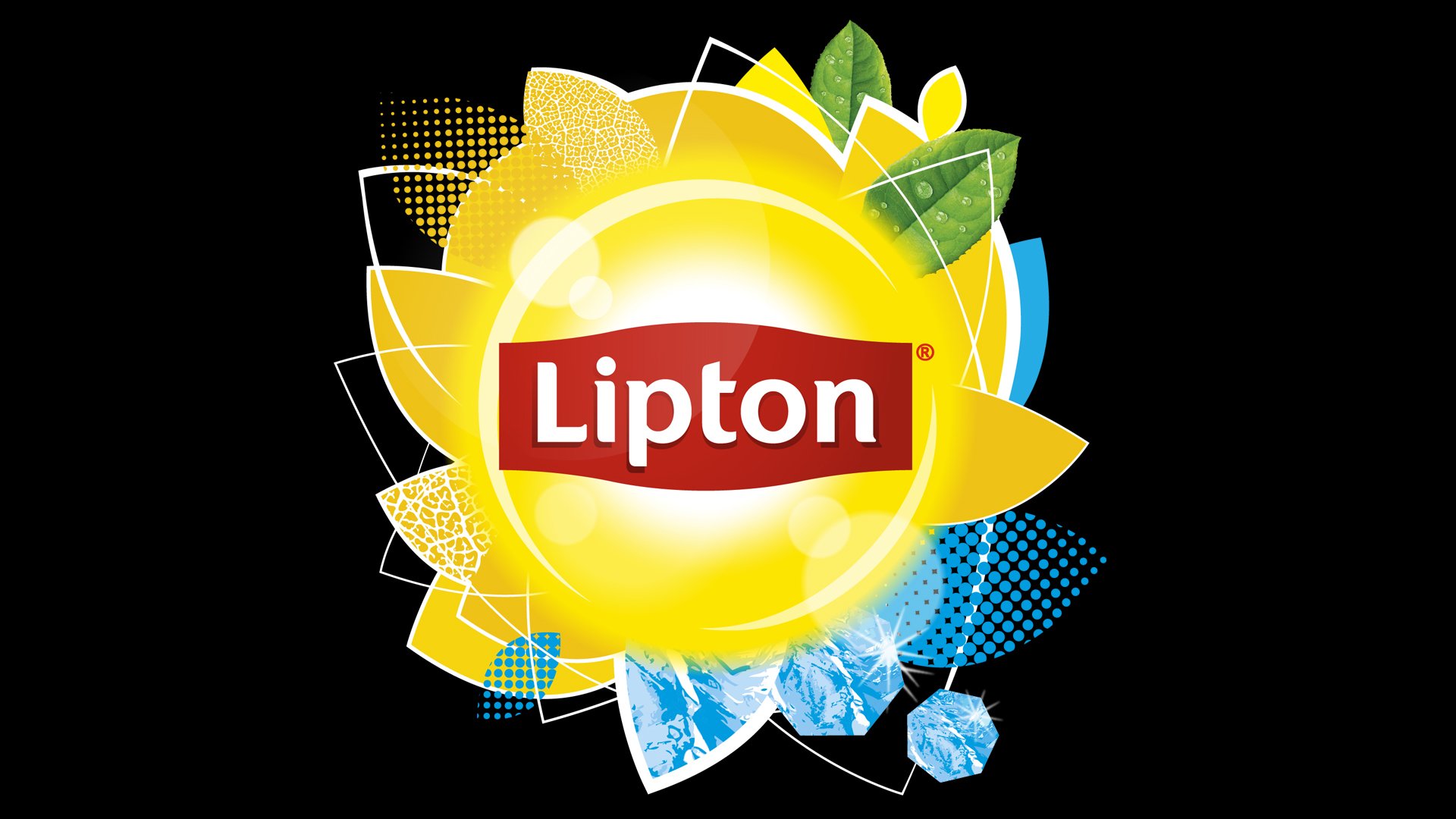
2014 – Today
![]()
The typeface on the iconic Lipton logo was changed in 2014. Slightly visible sharp serifs were complementing smooth thick letter lines with rounded shapes. The red badge changed its black outline to white and is now placed on a gradient yellow circle, which resembles the sun and gives a sense of warmth, love, and friendship.
Symbol
The first symbol of Lipton tea were the yellow silhouettes of sailboats – tea clippers, on which tea was brought to the UK from Ceylon, and – a little sun.
Today the main symbol logo of Lipton is a radiant solar disc, the boundaries of which are so vague that they dissolve in the entire package. For residents of the UK (which is called the Foggy Albion for frequent foggy rainy weather), this symbol was extremely attractive, which largely predetermined the success of the brand.
Font
Few people at the end of the XIX century thought about fonts, logos and other advertising hype, like Thomas Lipton. But it was him – and the brand he created – that was the first in a row of indicators, and even entered the textbooks on marketing and advertising. It was Thomas Lipton who first ordered the development of a special font for the packaging of his tea. The font should have been restrained and conservative, but not too puritanical and “old-world”. In fact, for more than a century of the brand’s history, the font has changed slightly.
Background
![]()
On the first logos, the background was dark green, in order to emphasize the color of the tea leaf in contrast to the yellow image. Subsequently, the color became more restrained, and the intensity of the yellow radiance of the sun increased. Today, boxes with tea Lipton have a background, depending on the type of tea – from dark green to yellow


