

![]() CNRS Logo PNG
CNRS Logo PNG
CNRS, or French National Center for Scientific Research, is a French government-supported research organization that focuses mainly on fundamental research. In this capacity, it’s the biggest such organization in Europe, accommodating over 30,000 staff members.
Meaning and History
![]()
CNRS was created in 1939 in Paris. Besides actual research projects, the Center awards French scientists and researchers for their own personal projects each year, CNRS medals are prized in the European scientific community. The organization includes various specialized institutes. Its current structure was created in 1971.
The acronym CNRS stands for ‘Centre National de la Recherche Scientifique’, or ‘French National Center for Scientific Research’ in English.
What is CNRS?
CNRS is a government research organization in France, the biggest such organization in Europe. It’s also one of the most prestigious such establishments on the continent, mostly focusing on fundamental science research. There are older organizations, however, as CNRS was only founded in 1939.
1957 – 1970
![]()
The original emblem had a generally round shape. The central piece was a circle divided diagonally in two halves of white and black. Perpendicular to the divide, there are the last three letters of the acronym, ‘NRS’. They are colored black when against the white background, and white against black. The white area of the circle is also outlined in black.
Along the edges of the white, they also placed a curved black line to represent the letter ‘C’ in the name. Together, it and the letters inside comprise the entire acronym.
1970 – 1984
![]()
They changed the design heavily in 1970. The main detail is the organization’s own acronym, stylized in a specific way. They are all interconnected into a single arrow-themed black pattern. The tips of the first and last letters have arrowheads on their ends. The ‘N’ and ‘R’ share a stem, with arrowheads on either tip.
It’s also especially fluid and rounded, which is meant to represent progress, together with the arrows. On its right, there are five diagonal lines of different lengths and colors. They are, from left to right: blue, green, orange, purple and red.
The last touch is the full name of the organization, written beneath the acronym pattern. It’s written in three lines of thin simple letters, all colored in black. The characters are fully capitalized.
1984 – 1992
![]()
Little of essence changed in 1984. They basically colored the entire logo black, and that’s it.
1992 – 2008
![]()
In 1992, they changed the acronym piece in many ways. It’s now blue, but they also rearranged its form to make these lines appear even more like the letters they are meant to resemble. The five lines are now behind the letter ‘S’. They are shorter, clipped at the ends, and there are just three of them now. Two of them are partially blocked from view by the letter itself. They’ve also become light grey.
The full name piece moved to the right of this ensemble. The general appearance persisted, although the font changed to a more elegant and professional serif.
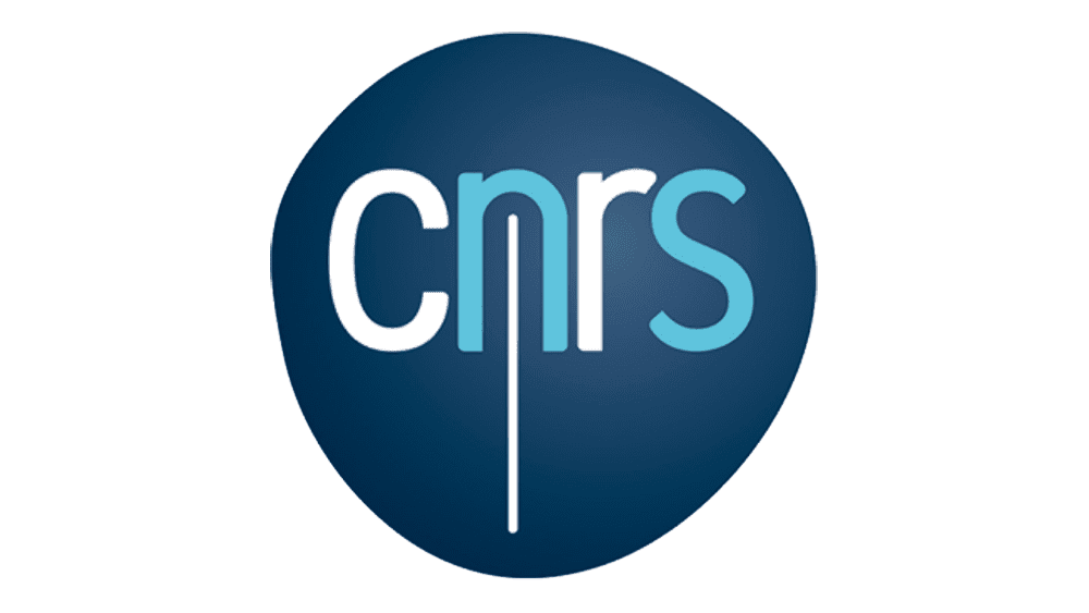
2008 – today
![]()
In 2008, this decades-old design was scrapped. Instead, they adopted this emblem: an uneven circle with letters inside it. It’s mostly dark blue, except for a lighter spot in the middle meant to illuminate the letters. The letters are written in the middle, using the colors white and cyan in alternating order. There’s also occasionally a thin white line running vertically from the letter ‘N’ and further down.
Font
The font in the 2008 design is a rather simple sans-serif style that looks like a common office typeface. Although these characters are big, they aren’t really capitalized, and all four look lowercase. The previous designs had more typical fonts, with thin uppercase letters.
Color
The main color of the organization has since the 90s been blue. The 2008 design has two different shades of this color, and it’s commonly used in the branding for this organization. Before that, the chief color was black for most of their logotypes and branding.


