

![]() DILG Logo PNG
DILG Logo PNG
While the logo of the Department of the Interior and Local Government drew inspiration from the Flag of the Philippines, it features unique imagery reflecting its mission.
Meaning and history
One of the first Cabinet positions of the revolutionary Philippine government, which was formed in 1897, was the Department of the Interior. Another institution under the same name was created in 1901, following the American occupation.
The governmental organization was abolished several times in its history, for the first time – at the beginning of World War II. In 1942, it started working again under the Japanese Occupation. In this way, it lasted a year more.
When the Philippines became free from Japanese forces in 1944, the Department of the Interior was resurrected. In 1950, the organization ceased to exist once again in its long history, to be restored only 22 years later under the name of the Department of Local Government and Community Development.
In 1990, DILG was formed as the result of the merger of several institutions, including the police.
Symbol
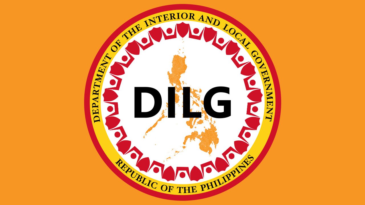
At the very center of the DILG Logo, there’s the lettering “DILG” in black capitals. Behind the abbreviation, the map of the Philippines can be seen. There’s a gradient effect, due to which the design seems to conjure up the warmth and glow of the sun.
You can also come across another version depicting the map in a slightly different manner. You can notice a “sandy” effect at smaller sizes, but it is only at a larger size that you can understand why it appears. The orange map features thin white lines for the borders separating the country’s administrative divisions, regions and provinces. As the official brand guidelines state, the map reminds us that the Department supervises all the territory of the Philippines.
The map and abbreviation are encircled by a red pattern, which may be difficult to “decipher” at first glance. If you take a closer look, you will see that the design is formed by shields and human figures between them (or at least the top parts of the human figures). The people represent the 17 regions of the Philippines. The shields are used to symbolize the interior and public safety sectors. Also, it conveys the concepts of peace and order. The fact that the shields and human figures are used alternatively emphasizes that joint efforts are necessary to establish peace.
The red pattern is encircled by the full name of the organization, the “Department of the Interior and Local Government,” while the text “Republic of the Philippines” can be seen below. The text is placed in a yellow ring. The outline of the roundel is solid red.
Evolution of the emblem
The new emblem has been arguably inspired by the old one – they share several design elements and the meaning. The palette is rather similar, too: it’s also dominated by red, yellow, and orange, although the shades are somewhat different. The navy of the old version was replaced by black in the updated one, which brought about more contrast.
While the previous DILG logo also features the shield theme, there’s a single shield, not a pattern. The human figures look somewhat different, and there’re also stars inspired by the national flag of the Philippines.
On the whole, the previous version appears slightly less professional and impactful than the current one.
Font
![]()
The letters follow traditional proportions and are perfectly legible. The font of the main text, the abbreviation, looks very much like Equip Bold published by Hoftype. However, as the glyphs aren’t very distinctive, it can also be a different font. The list of typefaces of the same style includes Quiet Sans Bold (by Dharma Type), Myriad® Hebrew Bold (by Adobe), and Motor Oil 1937 M54 Regular (by justme54s), to name just a few.
Colors
![]()
The combination of yellow and red was inspired by the national flag. While the brand identity guidelines mention the blue from the flag as one of the colors of the extended palette, it doesn’t actually appear on the current version of the logo. Instead, the actual DILG logo uses black, which creates decent contrast with the white background.
The red has the following coordinates: Pantone 1797C, hex: #C9282D. As for the yellow, the following tone should be used: Pantone 107C, hex: #FFDE15.
Each of the colors has a symbolic meaning: the passion for serving (red), openness to innovation (yellow), as well as honesty and loyalty to the people of the Philippines (blue from the full palette).


