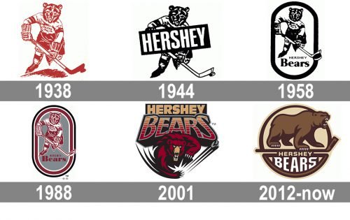
The earliest Hershey Bears logo was an anthropomorphic bear playing hockey. He was depicted in full equipment. Interestingly enough, this emblem was used for a very long time, until the 2000s. Although it went through a series of modifications, none of them altered the visual core.
Meaning and history
It was only in 2001 that the team switched to a new emblem. This time, the bear looked overtly aggressive, with its sharp teeth and claws.
1938 — 1943
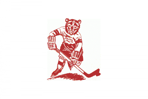
The very first logo of the Hershey Bears was created in 1938 and stayed with the club for the next five years. It was a slightly naive yet nice image of a bear in a hockey uniform and with a hockey stick, executed in a brown (with red shades) color palette on a white background. The “Bears” in cursive was written over the white jersey.
1944 — 1957
The redesign of 1944 brought several changes to the Hershey Bears visual identity. First of all, the color palette was switched from brown to black and white, which made the badge stricter and stronger. Secondly, the “Bears” inscription on the jersey was replaced by a thick diagonally placed banner in solid black with the white uppercase “Hershey” in a classy bold sans-serif font written over it. The banner was drawn in an upright direction, evoking a sense of progress and motion.
1958 — 1987
The bear from the club’s emblem was emboldened and darkened up in 1958. It was now placed inside a vertically oriented oval frame with the end of the hockey stick and a puck placed directly on the frame. The two-leveled logotype was written on the medallion, right under the bear image. The “Hershey” was set in small capitals of a lightweight sans-serif typeface, above the bold enlarged “Bears” in a fancy serif font, in the title case.
1988 — 2000
In 1988 the oval medallion of Hershey Bears hockey club changed its color palette. Now the primary color of the badge was light gray (background), while the bear, the lettering, and part of the framing were colored in burgundy, and the accents were all white. The new combination of tones made the image looked more chic and professional, adding timelessness and elegance to a simple and brutal badge. The typeface of the inscription was also slightly changed, making the letters heavier and their contours cleaner.
2001 — 2011
For ten years, starting in 2001, the club was using a completely different from all the previous versions of Logo. It was a modern and bright badge with the dark red bear set under stylized enlarged lettering. The bear had its white claws sharp and long, and its eyes full of danger and intimidation. As for the wordmark, it was written in two lines using two different styles. The “Hershey” in straight sans-serif uppercase was set in plain beige on a solid black rectangle, while the “Bears” in all-caps had its first and last letters enlarged, and was colored orange and red with a horizontally striped pattern.
2012 — Today
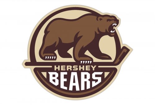 The 2011/13 season brought about a new logo. This time, the bear is standing on its four paws, one of them on a hockey stick. Together with the inscription “Hershey Bears,” it’s placed inside a bold brown circle.
Colors
Soft cream color creates an eye-pleasing combination with two shades of brown.


