

![]() Akron RubberDucks Logo PNG
Akron RubberDucks Logo PNG
The logo of minor league baseball team the Akron RubberDucks, as well as its name, was inspired by the rubber history of its home city.
Meaning and history
![]()
The history of the franchise began in 1980 in Lynn, Massachusetts. The club has gone through more than five names, from the Lynn Sailors to the current one, which was adopted in 2014. Today, it is a Double-A affiliate of the Major League Baseball’s Cleveland Indians.
1984 – 1987
![]()
Their first logo was adopted in 1984, when they were known as Vermont Reds. As such, the base of the logo was a big red ‘V’. It was a wide, squat, yet big letter. There was a big baseball, imposed over its middle in the same red color, as well as in white. In front of the ball, they’ve wrote the word ‘Reds’. The font was akin to the big letter behind: squat, wide and sans-serif. The only other addition was the continuous white line in the top half of these letters.
1988
![]()
In 1988, the team switched to Vermont Mariners. The logo design was similar, except they colored all the red bits into dark blue. Moreover, the word ‘Reds’ was replaced with ‘Mariners’, the letters in which were taller and thinner compared to the previous style. The line that ran through the letters in the previous version was still there, but not it became slimmer.
1989 – 1996
![]()
In 1989, they adopted a wide blue fringe with a vague baseball image in the center. The top and bottom bits of the ring had ‘Canton’ and ‘Akron’ written respectively. The letters were typical capital characters with dots in-between the characters. Both letters allude to the new name, which was ‘Canton-Akron Indians’. The latter word was plastered diagonally in front of the logotype’s center. It was colored red and had a paint-like look.
1997 – 2013
![]()
Akron Aeros was the name until 2013. The logo used with it was a generally round badge with a black fringe and a blue center. The former had ‘Akron’ written on its top, in white. The blue core is barely visible, but there is a small Saturn-like planet near the place where the name is written. They colored in orange and yellow. The word ‘Aeros’ is written in big silvery letters. They are depicted at a perspective, meaning they gradually grow from left to right. They are also rotated to the left and up.
A red feline creature was their mascot. It’s depicted beneath the main logo with a baseball in its hand and in the process of dashing somewhere.
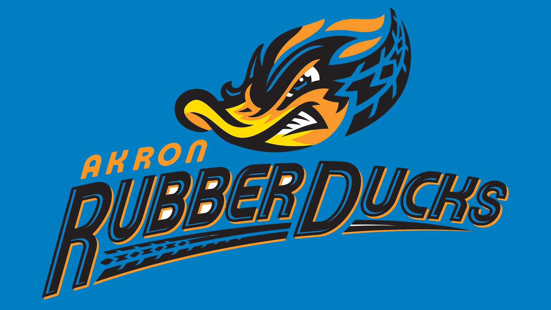
2014 – Today
![]()
In 2014, they became Akron Rubberducks. Many elements in this new logo are inspired by tires or rubber. For instance, the main element is the head of a duck with a malicious expression, mostly black plumage and a black trail to its right that depicts a tire pattern. Furthermore, there are flicks of red flame/plume coming out of the ducks head. It’s likely supposed to be a ball of sorts. Beneath, the big word ‘Rubberducks’ is written in black letters with an orange tint around them. Most letters are underlined by another trail of black with a tire imprint. A small, orange ‘Akron’ is placed above and to its left.
Primary symbol
When the franchise was looking for a new identity, they decided to dwell upon the reputation of Akron, Ohio, as the Rubber Capital of the World. At the beginning of the previous century, all of the country’s big rubber companies were located here. The rubber theme can be seen everywhere, from the way the duck’s neck is depicted on the Akron RubberDucks logo (it reminds a tire), to the tire trace behind the word “RubberDucks.”
Cap and jersey emblems

The two main parts of the logo are used independently on the team’s uniforms. There’re also two versions of the “A” logo.
Colors
![]()
While the palette of the Akron RubberDucks logo appears to be rather complex, at first glance, in fact, it consists of only five colors – black, blue, orange, yellow, and white. The motley effect isn’t due to the variety of colors but due to the abundance of small elements.


