The logo of the Salt Lake Bees is built around a bee, which seems to be the most reasonable mascot for such a name.
Meaning and history
The history of the minor league baseball team started in 1994 when the Portland Beavers relocated to Salt Lake City. The team initially played as Salt Lake Buzz, then spent five years under the name of the Salt Lake Stingers before adopting its current name in 2006. The team is the Triple-A affiliate of the Los Angeles Angels.
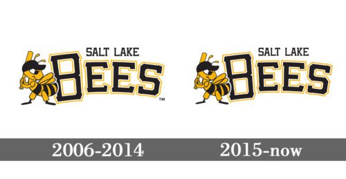
2006 — 2014
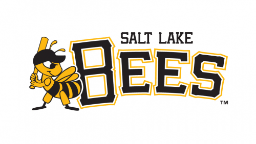
The Salt Lake Bees logo from 2006 featured a funny caricature of the bee, which was standing on the left from the logotype, holding the baseball bat. The bee was executed in the dark yellow and black palette and was wearing a black cap. As for the text part of the logo, it was written in all capitals, slightly arched up, in a square serif font, with the letters in black, outlined in white and yellow. The first letter, “B”, was slightly enlarged. The black “Salt Lake” in the uppercase was set above the logo in a straight line.
2015 — Today
The redesign of 2015 kept all elements in their place and style. Almost nothing was changed, just the contours of the bee, and the letters were refined and cleaned, so the whole badge started looking more confident and professional. This is a bright and eye-catching logo, which is instantly recognizable and brilliantly reflecting the mood of the club’s players.
Colors
The choice of colors – black, gold, and white – appears to be the most reasonable one for a “bee” theme (black and gold for the bee, white for the background). We can point out, though, that the team seems to have experimented a bit with the saturation of the gold color.


