

![]() Zotye Logo PNG
Zotye Logo PNG
Zotye is the name of a former Chinese automaking company, which was established in 2005, and ceased all operations 16 years later, in 2021. The company specialized in the production of cars, copying European and American models, and even some Chinese ones.
Meaning and history
![]()
The history of the Chinese company Zotye began in 2003. At that time, the future car manufacturer specialized in the assembly and sale of car parts. Zotye Auto a car manufacturing brand was founded two years later, in January 2005.
The first model was the Zotye RX6400 SUV, later renamed Zotye Nomad. Like most of the first Chinese cars, it bore a great resemblance to the already-produced Japanese or Korean cars. This car was a clone of the Daihatsu Terios.
Zotye Holding Group owned two trademarks: Zotye and Jiangnan. In addition to passenger cars, they also produced trucks, vans, commercial vehicles, motorcycles, and consumer goods.
However, the main specialization of Zotye was the production of replicas of famous other car brands, both European and Asian. As for technology, Zotye went its own way, not using the technology of European companies, but relying solely on its own.
What is Zotye?
Zotye was a small Chinese manufacturer of cars, which was founded in 2003, and started the production of vehicles in 2005. The company ceased all operations in 2021, claiming itself bankrupt. The brand was known for the copies of cars from the world’s most famous automakers.
As for the visual identity, Zotye was a pretty modern brand, which tried to follow the trends in the logo design, and to strengthen its badge, adding some brightness and smoothness to the elements throughout the years.
2005 – 2018
![]()
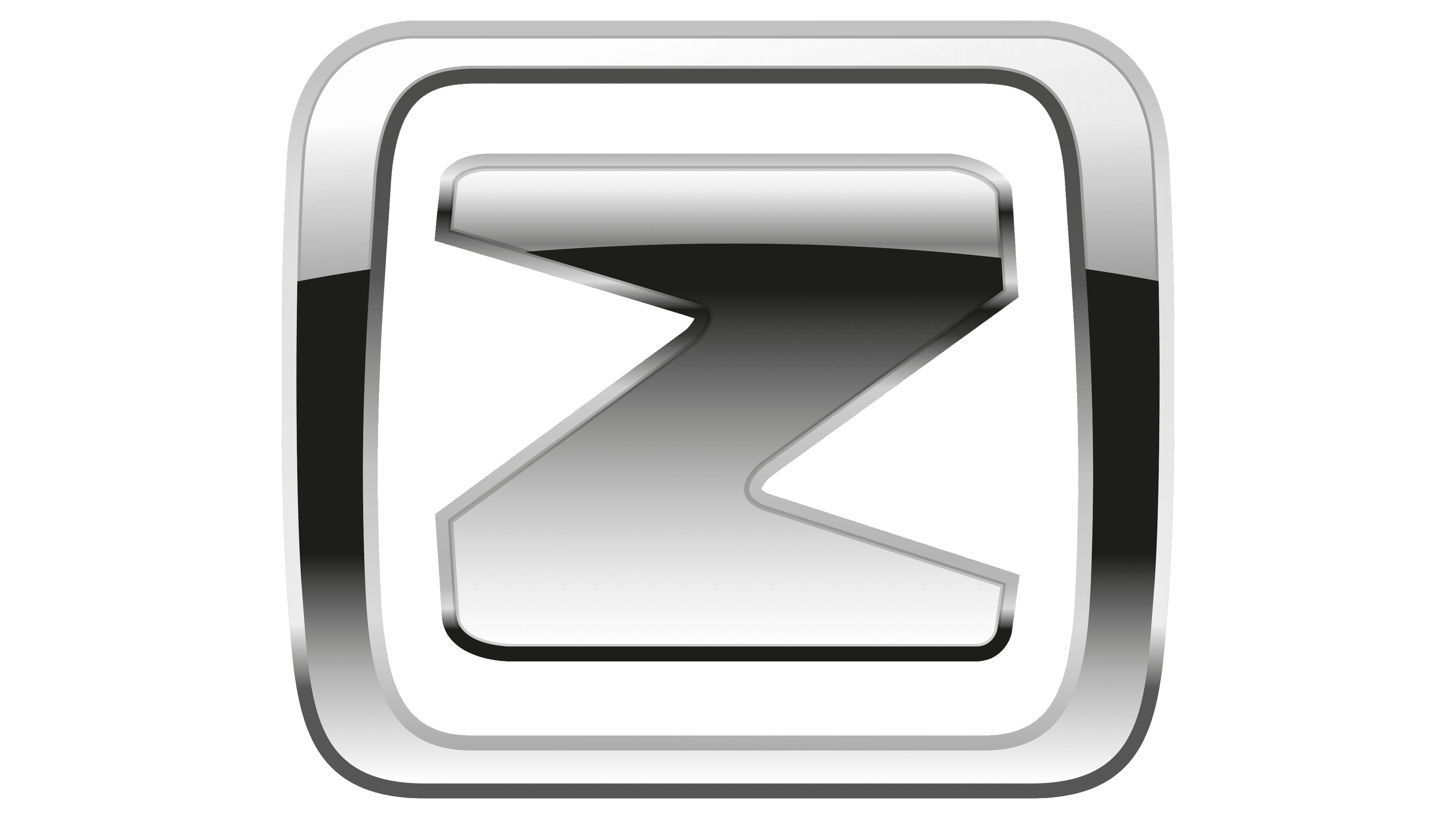
The original Zotye logo, designed in 2005, stayed with the Chinese automaker for more than a decade. It was a gradient three-dimensional silver badge, composed of an emblem, placed above a modern uppercase inscription. The emblem featured a thick and distinctive letter “Z” with the horizontal bars elongated and merging into a horizontally stretched rectangular silver frame with softened angles. The contours of the characters were straight and sharp, with the clean lines balancing the rounded corners of the medallion.
2018 – 2021
![]()
The redesign of 2018 has kept the concept of the Zotye visual identity, based on an emblem, set above the lettering, but completely changed both elements of the badge. The new emblem of the Chinese automaker also featured a letter “Z” enclosed into a square frame with softened corners, but the bars of the character got shorter and thicker, making up a bold rounded “Z”, which was set on a transparent background, not touching the edges of the frame.
As for the lettering, it was now set in two levels, with the Chinese version of the brand’s name set in a larger-size of letters above the English inscription. Both lines of the wordmark were set in a deep shade of red, which was evoking professionalism, and passion.
Font and color
The heavy uppercase lettering from the last badge of the Zotye automaker was set in a custom sans-serif typeface with the contours of the capital characters slightly extended. The closest fonts to the one, used in this insignia, are, probably, Magnox Display Rounded, or Avionic Wide Black, but with some significant modifications of the contours.
As for the color palette of the Zotye visual identity, it was based on a classy powerful combination of gradient silver and red; which looked bright, strong, and confident. Silver is the most commonly used color for car badges, and red balances its lightness and simplicity, elevating the logo and adding passion and excellence to the image.


