

![]() Zero Motorcycles Logo PNG
Zero Motorcycles Logo PNG
Zero is a fresh American bike producer founded in 2006. The production mostly focuses on high-performance electric bikes. The enterprise has been a moderate success, and several intriguing models have already been released. They don’t seem to sacrifice power and performance, as other similar manufacturers often do.
Meaning and History
The name ‘Zero’ might be indicating the lack of pollution coming out of these motorcycles. After all, every one of their bikes has been an all-electric model. Furthermore, they are also fairly powerful (200 km/h – max speed) and seem to do well commercially, given their unorthodox approach to bikes.
2006 – now
![]()
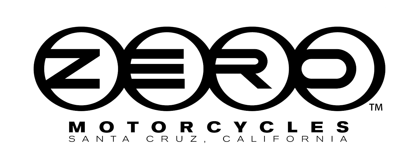
The official logo has two main components: a ‘slashed zero’ sign and the name proper. They seem to be used wherever it would be prudent to put them. For instance, the sign is oft used on bikes or on corporal property, while the writing is used whenever possible.
The sign looks like a square with rounded corners and a diagonal line cutting the inside of it in two (from top-right to bottom-left). It goes in several variations: in black, white and metal. The metal one is generally used on some official content, like the commercials.
The text features the name itself in uppercase and the smaller word ‘motorcycles’ beneath, also in uppercase. Both are black. While the bottom text is a bit stricter and thinner, the name is absolutely fat. The letters are visibly rounded (to fit the aesthetic of a symbol, no doubt).
Both components usually stand nearby, with the sign a standing a bit to the left.
Emblem and Symbol
The bikes use both the name and the sign as a brand symbol. Most models often wear a zero sign on top of a black circle. Some models, like Zero S, prefer to wear the name (without the ‘motorcycles’ part). Some, like Z-Force, even use a unique name image, where every letter is encircled in a ring, almost like the Olympiad logotype.


