Bajaj is an Indian brand of motorbikes and rickshaws developing company, which was founded in 1972 and today is the 2nd largest brand in the region and one of the hugest in the world.
Meaning and history
The Bajaj visual identity history is more stable than colorful. The company has undergone only one dramatic redesign, which happens in 2004, and since then the logo is just being slightly refined and modernized.
What is Bajaj?
Bajaj is the name of an Indian manufacturer of bikes, which was established at the beginning of the 1970s. Once very popular in its country, the brand started an international expansion in the 1990s, and today its bikes and scooters are distributed all over the globe and are loved by the customers for pretty good quality and affordable prices.
The 1979 – 2004
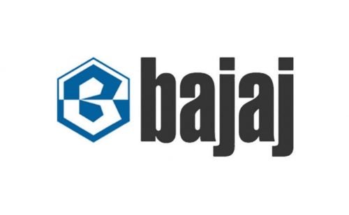
The first Bajaj logo was designed a few years after the company’s establishment, in the mid-1970s. It was comprised of a nameplate and an emblem on its left.
The wordmark was written in all lowercase lettering executed in a traditional typeface, which was bold and narrowed. The dark gray, almost black, the color of the nameplate added a sense of stability and strength.
The Bajaj original emblem featured a sharp stylized letter “B” set in a vertically located hexagon. The figure was horizontally divided into two equal parts, where the bottom half was colored blue and had a white part of the letter “B”, and the white upper part contained a blue half of “B”.
The Bajaj “B” repeated the contours of the hexagon frame and looked very geometric and symmetrical.
It was a sharp logo, which showed the brand as powerful and respected. The emblem was an expression of authority and progress, the brand’s loyalty and reliability.
The first Bajaj logo was balanced and interesting to look at. A remarkable and memorable visual identity design stayed with the brand for almost thirty years.
2004 – Today
The company decided it was time to change with the beginning of the new century. The Bajaj logo was redesigned in 2004 by a famous bureau Elephant Design.
The new logo is composed of a wordmark with, and the emblem is still placed on the left side of it.
The nameplate inscription now is written in all capital letters with the use of a new futuristic typeface, featuring rounded angles and diagonally cut sides. It is smooth and modern lettering, reflecting the brand’s values of quality and expertise in design.
The new Bajaj emblem is a completely modified original insignia. The hexagon framing was removed from the logo and the Bajaj symbol gained a new contemporary shape. The stylized letter “B” is now composed of two “V”-like figures, positioned horizontally with their sides crossing each other.
The Bajaj logo looks like a flying bird, or like two arrows. Whatever the image is, it is a definite symbol of moving forward, of progress and dynamics of the huge I down brand.
The color palette of the Bajaj logo remained the same — classic blue with white, which symbolizes stability, trustworthy and authority of the company. The white of the wordmark and emblem is a celebration of loyalty and high-quality of the brand’s products.
Sometimes Bajaj uses a monochrome palette when there is a need. And on a black ground, the company’s logo looks more brutal and powerful.
It is a great visual identity design, which is contemporary, sharp and full of confidence. The brand got a new, instantly recognizable symbol, which is meaningful and balanced.
Font and Color
The futuristic uppercase lettering from the primary Bajaj logo is set in a sharp custom sans-serif typeface with interesting and progressive contours of the characters. The closest fonts to the one, used in this insignia, are, probably, 946 Latin Wide, and Winner Sans Extended Extra Bold, wit with the contours of the glyphs modified and the letters placed close to each other, which affects the cuts of the horizontal bars.
As for the color palette of the Bajaj visual identity, it is based on a calm and pleasant shade of blue, which evokes a sense of trustworthiness and reliability, shows the company as a professional one, and represents the safety and quality of its two main values.


