Zalo is the name of an online-messenger application, which was created in Vietnam in 2012. Today the app is a really strong competitor of such popular players like WhatsApp and Viber, with millions of users across the globe, but mainly in the Asian region.
Meaning and history
Zalo is an online messenger from Vietnam, which has some additional functions compared to such popular applications as WhatsApp Viber, and Line. Zalo works similarly to others: you have to register in the app using your phone number, export contacts, and start chatting. Although here you can also join public chat rooms, and meet new friends from all over the globe.
The name of the application, Zalo, is a derivative from two Vietnamese slang words, “Zing” and “Ali”, which are used to say “Hello” while talking over the phone.
The Zalo app has many benefits, such as recording video messages, finding friends nearby, and sharing information with friends, colleagues, and family, in the most convenient way possible.
What is Zalo?
Zalo is the name of an online messenger and social media, created in Vietnam in 2012. The application allows you to send text and voice messages to your contacts, make voice and video calls, and also get new friends by joining public chat rooms.
As for the visual identity, the messenger uses simple shapes and elements, which reflect its purpose and essence, and a clean fresh color palette, making the badge look professional and trustworthy.
2012 – 2019
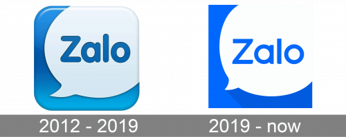
The original Zalo logo was created in 2012 and stayed with the application for almost seven years with no changes. It was a blue and white square icon with gradients, glossy surface, and rounded angles. The blue background of the square had a white dialogue bubble overlapping it on the upper part, with a slight shift to the right. On the bubble, the bold rounded “Zalo” in blue sans-serif title case was set. The letters were a bit narrowed and placed close to each other.
2019 – Today
The redesign of 2019 simplified and minimalists the Zalo badge, making the color palette flat and removing all gloss from the square blue and white badge. The composition was kept untouched, but the white dialogue bubble was now taking more space, than on the previous badge.
Another important thing that was redrawn in 2019 is the logotype. The typeface was changed to a more modern one, with the letters in full rounded shape now, and the bars cut straight.


