Yamaha is an iconic Japanese brand of motorbikes and water transport manufacturer. The Yamaha Motor branch was founded in 1955 and gained huge respect and popularity across the world. Today the brand has more than 100 subsidiaries worldwide and is one of the most famous motorcycles manufacturers.
Who makes Yamaha engines?
Yamaha engines are produced by Yamaha Motor Company, a special version of the broader Yamaha Corporation focused on manufacturing engines for a wide array of applications, from motorcycles and scooters to ATVs and boats, all designed with the precision and quality that characterize Yamaha’s world-class products.
Meaning and history
The name of the brand, Yamaha, can be translated from Japanese as a “mountain blade”, which is a reflection of the samurais’ legacy. The company’s visual identity has also always been a celebration of Japanese heritage and symbolism.
For the first decade after the company’s foundation, Yamaha Motors didn’t have a complete logo, it used the Yamaha Corporation symbol, created at the beginning of the twentieth century, which is still the basis of the brand’s visual identity.
When did Yamaha change its name?
Yamaha underwent a name change from Nippon Gakki to Yamaha Corporation in 1987, a move that reflected its expanding range beyond musical instruments into a variety of sectors, including motorbikes and electronics, underlining its evolution into a global brand.
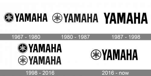
1967 – 1980
The official Yamaha logo was designed in 1967 and featured a wordmark with an iconic symbol on its left. The logo is executed in a monochrome palette, where the black is the main color. The wordmark is written in all capital letters, using a strong sans-serif typeface with strict clear lines.
1980 – 1987
In 1980 the brand decides to lighter the emblem and switches the colors of the image and the background. The logo looks more balanced and fresh now. The wordmark’s lines are refined and the lettering is more elegant in this version.
1987 – 1998
In 1987 the brand uses a single wordmark for its logo. Yamaha removed the emblem in order to get a more minimalist and modern look, this concept stayed with the company for more than ten years, but the rich history and heritage came back as the main value in 1998.
1998 – 2016
The redesign of the Yamaha logo, held in 1998, brings back the iconic symbol and adds color to the brand’s visual identity. The monochrome palette is replaced by red and white, which symbolize the passion and energy of the powerful company.
The wordmark, executed in a neat and confident typeface, which is close to Swiss 911 Extra Compressed, features narrowed and bold lettering, which looks remarkable in the new red color.
2016 – now

Since 2016 the version with the white circular medallions becomes a primary one. It represents three tuning forks in a circle and the name of the company’s founder is written in Latin. Compared to the previous badge, the lettering on the new one is executed in narrowed capitals, which only makes the whole image stronger and more stable. The strict straight lines and cuts of the Yamaha inscription bars balance the circular shape of its iconic emblem and make the look of the insignia harmonious in all aspects.
What does the Yamaha logo mean?
The logo of the company Yamaha, known for its tuning fork mark, symbolizes rhythm and harmony, reflecting the company’s commitment to creating world-class products, including musical instruments and more, with a design that incorporates simple lines and vectors to convey its foundational values.
The symbol
The main element of the Yamaha visual identity is its symbol, which has been the central figure of the company’s emblem since its establishment. The emblem depicts three crossed tuning forks enclosed into a circular frame.
This iconic image symbolizes the 3 main aspects of the company’s development: technology, production, and sales. It appeared when the company felt itself the one, able to change its attitude toward business and implement a new approach. The motto of Yamaha has always been based on the alliance of 3: Production + technology + marketing.
Is Yamaha Motors and Yamaha Music the same?
Yamaha Motors and Yamaha Music originated from the same Japanese multinational corporation but have since evolved into separate entities. The former focuses on manufacturing world-class products like motorcycles, scooters, and ATVs, while the latter is renowned for its musical instruments, including pianos and guitars, both embodying the ethos of innovation and quality established by Torakusu Yamaha.
Although today the company also gives another explanation of the three tuning forks: Customer, Society, Person.
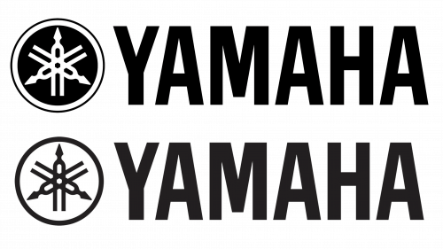
Depending on the product of the brand, the frame can use single or double contouring.
Another difference in the symbols is that Yamaha Corporation has three tuning forks inscribed into a circle, while Yamaha Motor Company has the tuning forks crossing the circle, or at least the internal one.


