Wiesmann is a brand of custom-built sport-cars, which was established in 1988 in Dülmen, Germany. It is a young but widely recognizable company, whose main value is quality and design expertise.
Meaning and history
During the 30 years of its history, the Wiesmann visual identity featured one iconic symbol, which was only slightly modified throughout the years.
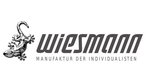
Wiesmann has a unique and highly recognizable logo, which is composed of a wordmark and an emblem on its left.
Font and Color
The wordmark is executed in a custom italicized typeface with bold thick lines and sharp angles. The letters are narrowed, which makes the nameplate look stylish and futuristic. The open contours of “E” and “A” add air to the lettering, as well as a thin line between the body and the dot of the “I”.
The wordmark is complemented by a straight and strict tagline “Manufaktur Der Individualisten” in all capital letters.
The royal blue of the wordmark and dark gray of the Wiesmann tagline reflect the brand’s authority and professionalism, evoking a sense of reliability and trust. It is a classic and elegant combination, which makes the logo look more sleek and distinct.
The Emblem
The iconic Wiesmann emblem is a silver-gray image of a gecko, thick is drawn with great attention to detail and looks alive and moving.
The gecko is shown stuck vertically to the wall, which symbolizes the Wiesmann car on the road — it just sticks to it.
It is a very remarkable and one of a kind visual identity symbolic, which makes the brand stand out and fully shows its philosophy.


