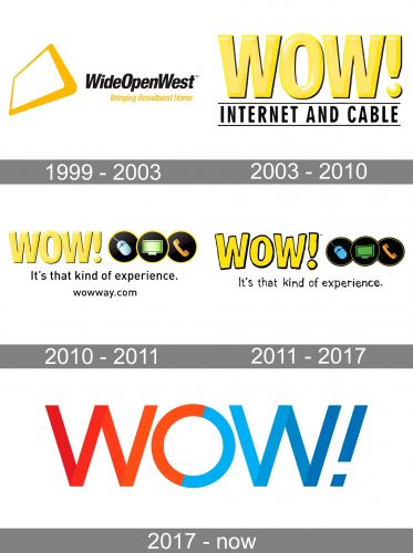
One of the largest cable operators in the US, WideOpenWest (WOW!) has a vivid, dynamic, and eye-catching logo. It has gone through at least five modifications.
Meaning and history

WideOpenWest, also known as WOW, is one of the largest cable television providers in the United States. The company was established in 1996 in Colorado, and today operates in ten states of the USA. WideOpenWest has more than 800 thousand subscribers from all over the United States.
Apart from cable television; the company provides such services as IPTV, digital cable, broadband, HDTV, Internet, and internet security.
What is WideOpenWest (WOW!)?
WOW! was named the sixth-largest cable operator in the United States in 2017. The range of services on offer includes landline telephone, cable television, and broadband Internet services.
1999 – 2003
The oldest WideOpenWest (WOW!) logo already brought about the combination of gold and black, which was present in the palette for the following fifteen years.
Originally, the design featured the full name of the brand in small italicized letters with a dynamic and abstract emblem to its left. Moreover, as the company wasn’t well-known, it was essential to include an explanatory tagline. It was placed below the wordmark and read “Bringing Broadband Home.”
2003 – 2010
While the initial insignia appeared downright amateurish, the following one was already sleek and professional. The parts of the design seamlessly merged together.
The palette remained roughly unchanged (to establish a connection with the brand’s heritage). This time, the company used the abbreviated name, which already resulted in a more minimalist style. The logo was dominated by the large word “WOW!” in bold letters. There weren’t italicized and featured a gold gradient.
The explanatory tagline below (“Internet and Cable”) was also shorter and more straightforward without sacrificing meaning. However, there was additionally a more cluttered version introduced with a longer tagline.
2010 – 2011
The textual explanation was replaced by a visual one. In this logo, the designers opted for small icons to represent the range of services on offer: a mouse, a desktop computer, and a handset.
The tagline was still there, but it grew smaller and served another purpose – it was selling rather than explaining.
We can add that this version was more cluttered and didn’t hold a candle to its stylish predecessor.
2011 – 2017
The gradient disappeared from the letters. Yet, they didn’t look totally flat due to the slightly uneven sides and the black outline. The uneven sides created a casual, playful style. The icons lost the gradient as well and became more saturated.
The proportions of the elements have remained pretty much the same.
2017 – present
The WideOpenWest (WOW!) logo was redrawn in a dramatically different manner. It was a definite change for the better, with its simple, yet arresting shapes and colors.
Now, there was only the word “WOW!” featuring several shades of red and blue. The way the shades followed one another added a dynamic style (the letters appeared to be formed by a ribbon).
The icon, which was formed by the capital “W” and an exclamation mark, was equally effective.
Colors and font
While the older logos experimented mostly with yellow and black, the 2017 version broke the new ground by combining red, orange, light and dark blue.
The simplicity of the font contributes to the overall minimalist style of the WideOpenWest (WOW!) logo.
The brand was officially established in the fall of 1996. The results of its first years were fairly modest – in 2001, it served about 200 people in the Denver area. The company has been publicly traded since 2017. Its major shareholder is Crestview Partners.
In early 2021, the number of subscribers reached around 850,600.


