

![]() Google Translate Logo PNG
Google Translate Logo PNG
Google Translate is an online service, launched by Google in 2006 in order to help their users with fast translations, available for more than 100 languages. Today the service is considered to be the most popular translation app in the world and has millions of daily users from across the globe.
Meaning and history
![]()
The visual identity of the Google Translate App is probably one of the most recognizable in its field. The white and blue icons cannot be confused with anything else and became synonymous with quality translation services for many languages.
There are two different logos for the software — the wordmark, which is used on the web, and an icon used for mobile applications.
WEB
2006 – 2009
![]()
As for the wordmark, it has always been more or less the same — since the date of the software’s launch in 2006, it was composed of a colorful “Google” wordmark and a light sans-serif “Translate”, placed on its right.
In the original logo, though, the lettering “Translate” was below “Google.”
2009 – 2010
![]()
In the two earliest versions, the word “Beta” could be seen below. The 2009 “BETA” version already positioned the word “translate” not below but to the right.
2010 – 2013
![]()
The word “beta” disappeared, while the wordmark grew lighter.
2013 – 2015
![]()
Until 2013 the second part of the inscription was colored blue, but then it changed to gray, as well as the lowercase was replaced by a title case.
2015 – Today
![]()
The word “Google” now features a simpler type, where the letters are formed by strokes of the same thickness. The word “translate” has grown bolder.
MOBILE
![]()
As for the icon, it also didn’t change much — designed in 2010, it was only redesigned once, in 2015. Actually, twice, because the first version of 2015 only stayed with the online translator for 6 months and was changed later in 2015. This is how the version we all know today was born.
![]()
2010 – January 2015
![]()
The very first Google Translate emblem was composed of two overlapping squares with rounded angles. One of them was light gray with a dark gray hieroglyph on it, another was colored blue and had a white “A” in the middle. The squares were placed diagonally one on the other and had a two-sided arrow, connecting them on the left.
It was a perfect graphical representation of the software’s essence and purpose, and the blue, white, and gray color palette of the visual identity symbolizes professionalism, responsibility, and quality.
The emblem stayed with the service for five years and was instantly recognizable all over the globe.
January – August 2015
![]()
In 2015, the icon was redesigned. Two squares were replaced by a folded two-colored rectangular, with its left part in blue, and right — in light gray. The original version of this logo featured a white letter “A” placed on the blue part, and a dark gray hieroglyph on the right part.
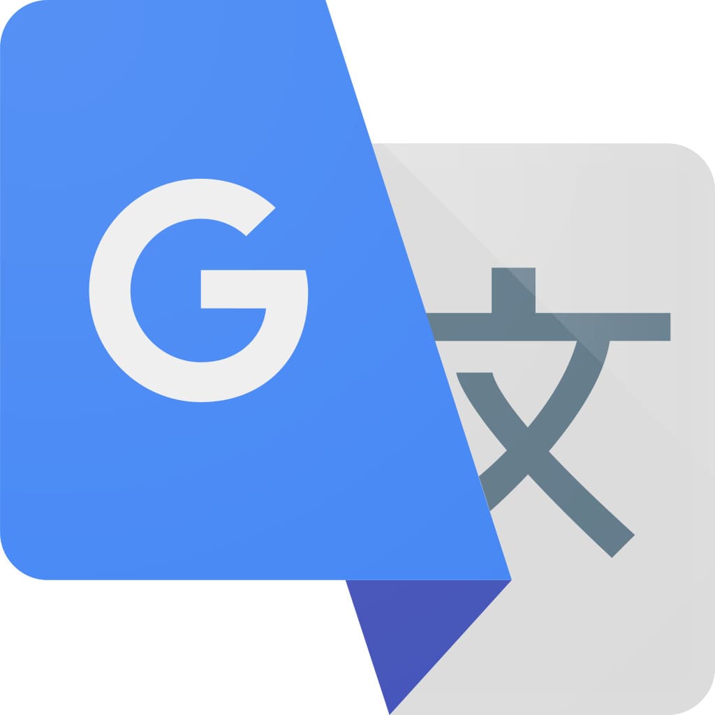
2015 – present
![]()
But the letter “A” was changed to “G” in September 2015, in order to show the affiliation of the service to Google.
![]()
Icon
The icon of one of Google’s most popular applications, Google Translate, is executed in a blue, white, and gray color palette, with the two letters in different languages set on a ribbon-like element in blue and gray. The Latin light gray “G” is set on the blue part of the ribbon, on the left, white the dark gray hieroglyph is set on the right, on the light gray background.


