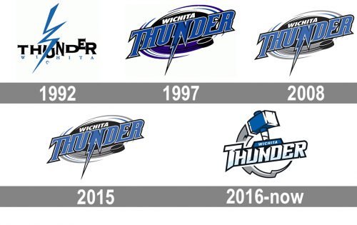
The Wichita Thunder’s inception was in 1992 and since then the ice hockey team have been based in the same place ‒ Wichita, Kansas.
Meaning and history
Wichita Thunder, founded in 1992, is a professional ice hockey team based in Wichita, Kansas. This franchise was established under the initiative of local businessmen to bring high-level hockey to the area. Over the years, Wichita Thunder has become a significant player in the minor league hockey landscape.
The team has a rich history of achievements, including multiple playoff appearances and championship pursuits in the Central Hockey League (CHL). Notably, Wichita Thunder made a remarkable impact in the early years, clinching the CHL Championship titles in 1994 and 1995, showcasing their dominance in the league. These early successes not only boosted the team’s popularity but also solidified its position as a formidable force in minor league hockey.
In recent years, Wichita Thunder continues to make strides in the ECHL, the league they joined in 2014. The team, known for its competitive spirit and strong fan base, remains dedicated to pursuing excellence on the ice. With a focus on fostering local talent and engaging the community, Wichita Thunder maintains its status as a vital part of Wichita’s sports culture, contributing to the ongoing development of hockey in the region.
What is Wichita Thunder?
Wichita Thunder is a professional ice hockey team, competing in the ECHL and known for its dynamic presence in the sport.
1992 — 1997
As the thunder theme is rather hackneyed, it is difficult to come up with something special. The Wichita Thunder’s first logo is just the team’s name in black and blue and a blue lightening bolt.
1997 — 2008
They marked the 2003-2004 season with a more modern and detailed logo. In the foreground there is the team’s name. “Wichita” is in white and “Thunder” is in blue outlined in white and black. The letter “N” is the image of a lightening bolt. A hockey attribute appears in this logo ‒ a black puck below the wordmark to the right. Behind the wordmark there is an abstract image of a storm depicted in black, white and purple.
2008 — 2014
2014 — 2016
The 2014 version features a slightly different color scheme ‒ the image of the swirl is in black, gray, white and blue.
2016 — Today

In the 2016 logo the thunder theme acquired a new look. They included the hammer used by the Norse god of thunder Thor. The head of the hammer is blue and white. A gray thunderbolt goes from it below and around the hammer. “Wichita” in white is on a blue background. “Thunder” is in white with gray shadow surrounded by a black border.


