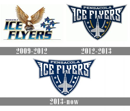
The Pensacola Ice Flyers have played nine seasons displaying different “aviation” logos.
Meaning and history
The Pensacola Ice Flyers started their career in professional hockey in 2009. As Pensacola where the team is based is famous for the legendary Blue Angels and naval aviation traditions, the franchise got the name the “Ice Flyers”.
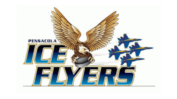
2009 — 2012
The team debuted with the logo that alongside with their name featured an eagle holding a hockey puck and four jet planes flying past the angry bird.
2012 — 2013
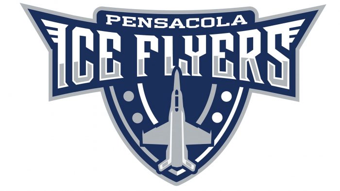
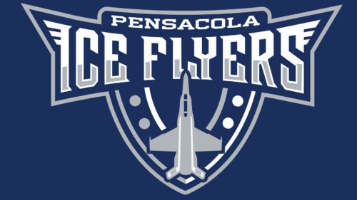
Having realized that the logo with four jet planes and an eagle looked complicated, the club switched over to a simpler logo design. Thus, the Pensacola Ice Flyers Logo of 2012 includes a shield in navy blue color. The word “Pensacola” in a white sans serif typeface is at the top of the shield. Set above the shield, just below the “Pensacola”, is a banner with the lettering “Ice Flyers”. The letters “I” and “S” are stylized to look like wings. There is also a plane at the bottom of the shield enhancing the aviation theme.
2013 — Today
The present Pensacola Ice Flyers Logo differs from the previous version only in the color palette. It is navy blue, grey and white, without any gold.


